Register For Our Mailing List

Register to receive our free weekly newsletter including editorials.

Home / 318

Vital lessons from the long-term Index Chart

Information overload is a modern day problem.

Between smartphones, websites and watches that alert you even when you have ignored the phone, it is hard, if not impossible, to tune out the noise of the world. Trade wars, Brexit, currency slumps and geopolitical tensions are just the headlines that can dominate the news cycle on any given day. Thankfully the Australian cricket team provided some welcome relief – and restored a little national pride – at Edgbaston this week.

A long-term look at markets

Vanguard has been publishing its annual index chart that plots the performance of all the major markets and asset class indices for Australian investors for 18 years. It allows investors to look at how markets have rewarded them for the risk taken through periods of market rises and periodic slumps.

This year’s chart provides the data to 30 June 2019, and naturally there is always a tendency to focus on what has topped the performance table. While interesting, that is not the key message from the chart.

The core message – and the reason for continuing to publish it over such an extended period of time – is to understand the power of markets over the long-term.

Think of a major event that roiled investment markets and look at that point on the chart, say, the last Australian recession in 1992 or the collapse of Lehman Bros in 2008 to understand its impact at the time. Then zoom out to see how it affected returns over the full 30-year time period covered by the chart.

The other message provided by the index chart is when investors lean towards wanting to predict what will be the top performing asset class next year … and the year after that.

You can view the digital version of the chart here (or order a print copy here) but if you are tempted to try and time markets, it’s worth taking a look at the table below from the index chart brochure which shows the total returns across all the major asset classes featured in the chart.

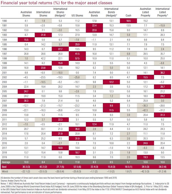
No discernible performance pattern

The best and worst performing asset classes are highlighted across each year, and feel free to let us know if you spot a performance pattern because what we see is what Burton Malkiel captured so elegantly in his investment classic, A Random Walk Down Wall Street.

The index chart shows the performance of markets over the long term, but for individual investors its value is in understanding how you blend all of those markets to create a portfolio with the right asset allocation to achieve your investment goals within a risk level that you are comfortable with.

For investors, a sense of perspective is a critical tool in the armory that can help tune out short-term noise, focus on your long-term goals and, as the legendary founder of Vanguard, Jack Bogle said, help you to “stay the course”.


Robin Bowerman is Principal and Head of Corporate Affairs at Vanguard Australia, a sponsor of Cuffelinks. This article is for general information and does not consider the circumstances of any individual.

For more articles and papers from Vanguard Investments Australia, please click here.


3 Comments
Trevor
August 08, 2019

If the house is your residence then you need to factor in the value of living in it rent free and the tax free status of the capital appreciation.

Work out how much rent you would have paid (out of after tax income) over the years and add that to the capital appreciation of the property and it starts looking like a pretty good investment.

Also non financial benefits such as not having to deal with a landlord or being forced to move need to be factored in.

For what its worth I think negative gearing property investments is overrated.

Kevin
August 08, 2019

Depends what you mean by property Steve,it doesn’ t mean a house.World REITS excluding Australia,all dividends reinvested.

To get an idea take an investing life of 40 years,you started early.The accumulation index gives a value of 70K now approx.Take an average house in 1980 in my state and it was roughly $40K.

That 40K put into shares would now be $2.8 million.Of course the management fees would also be a lot over those decades and greatly reduce that return.

The house is around $400K now,the holding,insurance and repairs and maintenance costs of a property are huge.The rent cannot be reinvested.

Take out the reinvesting of dividends and the index would need to be multiplied by 80.So 80 x 6500 would be 520K.Not taking out costs etc.

Just my 2 cents worth,I don’ t understand why people think investing in houses is wonderful.
Investing in REITS by all means,but they are volatile.

Steve
August 07, 2019

The most useful part of this wonderful chart is the long term average return at the bottom. Property is the long term winner (barring US shares which have been through a ridiculous bull market)


Leave a Comment:

banner

Most viewed in recent weeks

Raising the GST to 15%

Treasurer Jim Chalmers aims to tackle tax reform but faces challenges. Previous reviews struggled due to political sensitivities, highlighting the need for comprehensive and politically feasible change.

7 examples of how the new super tax will be calculated

You've no doubt heard about Division 296. These case studies show what people at various levels above the $3 million threshold might need to pay the ATO, with examples ranging from under $500 to more than $35,000.

Are franking credits hurting Australia’s economy?

Business investment and per capita GDP have languished over the past decade and the Labor Government is conducting inquiries to find out why. Franking credits should be part of the debate about our stalling economy.

Here's what should replace the $3 million super tax

With Div. 296 looming, is there a smarter way to tax superannuation? This proposes a fairer, income-linked alternative that respects compounding, ensures predictability, and avoids taxing unrealised capital gains. 

The rubbery numbers behind super tax concessions

In selling the super tax, Labor has repeated Treasury claims of there being $50 billion in super tax concessions annually, mostly flowing to high-income earners. This figure is vastly overstated.

9 winning investment strategies

There are many ways to invest in stocks, but some strategies are more effective than others. Here are nine tried and tested investment approaches - choosing one of these can improve your chances of reaching your financial goals.

Latest Updates

Taxation

100 Aussies: seven charts on who earns, pays, and owns

The Labor government is talking up tax reform to lift Australia’s ailing economic growth. Before any changes are made, it’s important to know who pays tax, who owns assets, and how much people have in their super for retirement.

7 key charts on the state of the Australian property market

The Australian property market stirs fierce debate - often bullish optimism versus crash predictions. But beyond the noise, seven charts reveal what's really driving prices and the outlook for residential real estate.

A simple alternative to the $3 million super tax

Division 296 aims to introduce improved fairness into the superannuation system, yet is overly complex. This scours the world for better ideas and suggests a simpler alternative which can achieve the same goals.

CBA and the index conundrum for super funds

After the hyperbolic rise in CBA shares, super funds are floating the idea of carving out the weightings of ASX bank securities and indexing them within their portfolios. This looks at why that might be a big error.

Strategy

10 policies to drive Australian productivity higher

Here's a comprehensive list of proposed reforms to fix Australia's stagnating economy, including introducing a flat income tax rate, reducing migration, and making childcare tax-deductible.

Interviews

Where to find big winners in Asia

As more money looks for a home outside the US, Asia may soon get some love. Fidelity's Anthony Srom outlines the best places in Asia to invest, including in Chinese consumer names, Indian financials, and Thailand.

Investment strategies

We have trouble understanding the time value of money

We overvalue the present and underestimate the future - it’s a cognitive glitch called hyperbolic discounting. It affects savings, spending, and loans, and it's more common - and costly - than we think. 

Sponsors

Alliances

© 2025 Morningstar, Inc. All rights reserved.

Disclaimer
The data, research and opinions provided here are for information purposes; are not an offer to buy or sell a security; and are not warranted to be correct, complete or accurate. Morningstar, its affiliates, and third-party content providers are not responsible for any investment decisions, damages or losses resulting from, or related to, the data and analyses or their use. To the extent any content is general advice, it has been prepared for clients of Morningstar Australasia Pty Ltd (ABN: 95 090 665 544, AFSL: 240892), without reference to your financial objectives, situation or needs. For more information refer to our Financial Services Guide. You should consider the advice in light of these matters and if applicable, the relevant Product Disclosure Statement before making any decision to invest. Past performance does not necessarily indicate a financial product’s future performance. To obtain advice tailored to your situation, contact a professional financial adviser. Articles are current as at date of publication.
This website contains information and opinions provided by third parties. Inclusion of this information does not necessarily represent Morningstar’s positions, strategies or opinions and should not be considered an endorsement by Morningstar.