Register For Our Mailing List

Register to receive our free weekly newsletter including editorials.

Home / 7

Mortality risk could be the death of you

Longevity risk is the risk that we will outlive our retirement savings. If this occurs, we would fall back on to the age pension and, while averting poverty, this would likely be below many people’s desired standard of living. What makes longevity risk complex is that it is actually a combination of other risks, investment and mortality risk. Mortality risk is the chance we will live longer than expected. While investment risk is well documented, this article is Mortality Risk 101. Actuaries love this stuff, and I’ll refrain from poking too much fun at them (I have friends and colleagues who are actuaries) especially since they’re so useful if you’ve mislaid your calculator.

Remaining life expectation at different ages

The first lesson in mortality risk is ‘conditional expectation’. There is a chance of death at all ages, and as you survive, your life expectancy extends. The table below, based on the Australian Life Tables 2005 – 2007 produced by the Australian Government Actuary (AGA - the source of all data in this article) illustrates this expectation.

Table 1: Remaining life expectation at given ages

Remaining Life Expectancy (Expected Age at Death)

Males

Females

At Age 0

79.0

83.7

At Age 30

50.2 (80.2)

54.4 (84.4)

At Age 65

18.5 (83.5)

21.6 (86.6)

Table 1 illustrates that if we make it to retirement (assumed to be age 65) then our life expectancy has increased by three to four years since we were born.

There are two key components of mortality risk: idiosyncratic risk and systematic risk. Idiosyncratic mortality risk is the randomness of individual mortality outcomes, even if we exactly knew future mortality rates in general (which we don’t). Systematic mortality risk is the risk that life expectancy of the general population changes (for example based on medical developments).

Before I illustrate these risks it is important to understand how life expectancy is calculated.

Mortality rates (probability of dying at a particular age)

Mortality tables are produced by the AGA and are based on observed mortality outcomes. The key data produced for mortality calculations is the mortality rate (actuaries label this ‘qx’) which represents the probability of a person dying at a particular age in their life. Chart 1 below illustrates male and female mortality rates (please note the altered, logarithmic scale of the vertical axis). For example, there is about a 10% chance that an Australian male will die at the age of 85.

Chart 1: Australian mortality rates by age
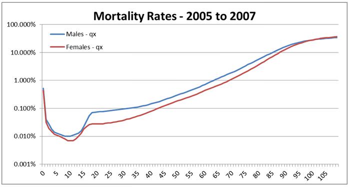
An easy way to understand this chart is to note that your chances of dying in any year of your life do not rise above 1% until you are over 60 years old.

If we were sure these mortality rates would remain fixed into the future, meaning there was no trend to improve and no systematic mortality risk of deviating from the trend, then we are left with idiosyncratic mortality, or the randomness of age of death given known mortality rates.

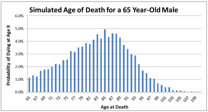
We can get a handle on this risk through simulation. Chart 2 below summarises the results from 10,000 simulations, presenting the likelihood of dying at a particular age for a random male currently aged 65.

Chart 2 is most notable for the breadth of possible outcomes, and the shape of the distribution is not symmetrical and far more spread out than a normal distribution. Regardless of whether the average mortality rate improves (lengthens) or not, we are all exposed to idiosyncratic (or individual) mortality risk.

Chart 2: Summary of 10,000 simulations of the age of death for a male currently aged 65.
However, systematic mortality risk, excuse the pun, appears alive and well. Historically mortality rates have improved over the very long term (100 years) and over shorter timeframes (25 years). There is evidence suggesting that over very short timeframes (the last three years) there has been continued improvement in mortality rates, a trend highly likely to continue.  An historical mortality improvement rate exists for each age and represents the annualised percentage change in the likelihood of dying at that particular age. Historical improvement factors are displayed in the chart below:

Chart 3: Historical mortality improvement factors.
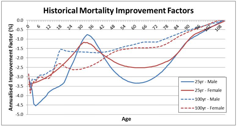
A negative number represents mortality improvement (that is, a reduced chance of dying at a particular age). We see that the largest improvement in mortality rates has been for the very young. We also have large improvement factors for ages 55 – 75 over the last 25 years, largely due to medical improvements for diseases such as cancer. The way mortality improvement factors are applied is relatively straightforward. Say the mortality rate (the chance of dying) at a particular age is 5%. Any improvement factor will simply be applied to this rate. So an improvement factor of -1% would mean that the mortality rate in one year’s time would be approximately 4.95% (5% x (100%-1%)) and this effect would compound through time. The upshot is that these negative improvement factors reduce our chances of dying at a specific age.

We don’t know what mortality improvements there will be in the future, as they will be affected by factors such as medical developments, government spending on health and education, changes to standards of living, lifestyle (such as expanding obesity). This creates the systematic mortality risk. The AGA calculates average life expectancy given how different historical (25 year and 100 year) Improvement Factors (IF) continue into the future. Their results are:

Table 2: Life expectancy for a 65 year old if historical improvement factors (IF) continue.

  Male Male Female Female
  25 year IF’s 100 year IF’s 25 year IF’s 100 year IF’s
2006 85.6 84.4 88.5 87.7
2010 86.3 84.7 89 88
2020 87.9 85.3 90.2 88.7
2030 89.4 86 91.4 89.4
2040 90.8 86.7 92.4 90
2050 92 87.3 93.3 90.7

Life expectancy increases as mortality rates improve

So here’s the main issue we are facing. There are plausible scenarios where the life expectancy of those who make it to 65 in 2050 will be 92 for males and 93 for females. Males who turned 65 in 2010 can expect to live to 84.7 if improvements continue at the 100 year average or to 86.3 if they continue at the 25 year average. A male who is 65 in 2050 would need to expect to make their retirement savings last nearly 50% longer (27 years versus 18.5 years). You can clearly see why governments around the world are implementing policies to push back retirement age.

That is it for the introduction. If you were making study notes for Mortality 101, I would suggest:

  • it is conditional expectation (how long we expect to live given we make it to 65) which really matters when we are thinking about longevity risk
  • idiosyncratic mortality risk represents the individual’s randomness of outcomes given an environment of known general mortality rates. The dispersion of individual outcomes across the population is very large
  • systematic mortality risk arises from uncertainty about the average improvement in population life expectancy. If historical mortality rate improvement factors persevere into the future then retirees are facing a scenario of having to make their retirement savings last much longer. And let us not forget the pressures this would place on funding the age pension for longer.

I apologise for the complex jargon. They sometimes quip that actuaries missed the first six years of school when all the other kids were learning short words. While it is easy to poke fun at actuaries, the role they play in understanding, measuring and managing mortality risk is crucial.

It is unfortunate that most people in the industry (super funds and financial planners) spend much more time considering and modelling investment risk than they do mortality risk.


David Bell would like to thank Associate Professor Anthony Asher from University of New South Wales for his assistance with this article.

 
4 Comments
Mark Thomas
April 03, 2013

Great article David.

Alun Stevens
March 30, 2013

A seriously technical presentation of the subject which potentially detracts from the key message he is trying to convey - namely that life expectancy at retirement is increasing and will continue to do so. Table 2 says it all, but the inclusion of both the 100 year and 25 year improvements in the same table without a proper explanation of what they mean is a bit confusing.

Chart 3 shows the annualised improvement factors, but the linkage between them is not explained nor the implications of this linkage. The point is that the annualised improvements over the last 100 years are smaller than the annualised improvements over the last 25 years. This means that the rate of improvement is accelerating except between ages 25 and 40. The 25 year annualised improvement factors are therefore potentially better forward estimates than the 100 year factors, but the change between them also implies that it may well be better still to use improvement factors that are higher than the 25 year improvements.

We use the 25 year improvements in our work.

Other interesting insights from the 100 and 25 year improvements are that the big improvements in neonatal mortality that drove a significant proportion of the improvement in life expectancy in the 20th century actually happened in the early 1900s - due primarily to better hygiene and the medicalisation of childbirth. It also led to a significant reduction in young female mortality which led to female life expectancy greatly exceeding that of males.

He also comments on medical improvements for diseases like cancer having led to the improvements in mortality in the 55 -75 age group. I don't think this is entirely true. Mortality rates from cancer once diagnosed have not really fallen although the period from diagnosis to death has lengthened significantly due to earlier diagnosis (the extension is more than just the time between the new point of diagnosis and the old point). Better screening has reduced the incidence of some cancers like cervical and colon. The incidence of lung cancer in men has reduced due to reduced smoking, but has increased in women due to increased smoking and will now probably reduce systematically due to reduced overall smoking.

I am not sure why he needed to run a simulation of 10,000 cases to derive his Chart 2. It could have been derived deterministically from the data behind Chart 1.

So, focus on the fact that life expectancy at retirement will keep on increasing at a rate of approximately 1 year per decade. Planners need to focus on both investment and mortality (actually lack of mortality) risk. But always remember, if you lose your money, your life expectancy reduces dramatically and the cause of death will be starvation!

David Bell
April 06, 2013

Thank you for your comments Alun.

On nearly all the technical issues I agree with you. I am an investment person looking at mortality risk, and not an actuary by training. However I don't think this detracts from the message I am trying to convey.

That message is that I think more groups, be they super funds, wealth management groups or financial planners need to be placed in a position where they can understand more than just mortality "rules of thumb". In essence I am saying that we need to model all risks - it is not good enough to model some in detail and others using rules of thumb. Amongst the wealth management industry I have a view that by and large the wealth management industry do more explicit modelling of investment outcomes than they do of mortality outcomes yet both are crucial to modelling lifecycle outcomes and the management of lifecycle risks. Having some sort of portfolio construction tool and then using simple mortality rules of thumb is, in my view, not a great combination. So that is why my article is more technical than an intro - it hopefully encourages wealth management groups to explicitly model mortality risk to the same standard that they apply for assessing portfolio risk. If they use actuaries to do this then all the better for you!

Cam
March 22, 2013

Great article. We talk about investment events creating a hole in pension planning. A great reminder that living longer without planning will have a deep impact. It makes me think about the broader impact as well on the families caring for the aged, financially and physically.


Leave a Comment:

RELATED ARTICLES

Longevity perceptions and post-retirement products

What financial risks do retirees face?

Should access to super and pensions depend on life expectancy?

banner

Most viewed in recent weeks

2024/25 super thresholds – key changes and implications

The ATO has released all the superannuation rates and thresholds that will apply from 1 July 2024. Here's what’s changing and what’s not, and some key considerations and opportunities in the lead up to 30 June and beyond.

The greatest investor you’ve never heard of

Jim Simons has achieved breathtaking returns of 62% p.a. over 33 years, a track record like no other, yet he remains little known to the public. Here’s how he’s done it, and the lessons that can be applied to our own investing.

Five months on from cancer diagnosis

Life has radically shifted with my brain cancer, and I don’t know if it will ever be the same again. After decades of writing and a dozen years with Firstlinks, I still want to contribute, but exactly how and when I do that is unclear.

Is Australia ready for its population growth over the next decade?

Australia will have 3.7 million more people in a decade's time, though the growth won't be evenly distributed. Over 85s will see the fastest growth, while the number of younger people will barely rise. 

Welcome to Firstlinks Edition 552 with weekend update

Being rich is having a high-paying job and accumulating fancy houses and cars, while being wealthy is owning assets that provide passive income, as well as freedom and flexibility. Knowing the difference can reframe your life.

  • 21 March 2024

Why LICs may be close to bottoming

Investor disgust, consolidation, de-listings, price discounts, activist investors entering - it’s what typically happens at business cycle troughs, and it’s happening to LICs now. That may present a potential opportunity.

Latest Updates

Shares

20 US stocks to buy and hold forever

Recently, I compiled a list of ASX stocks that you could buy and hold forever. Here’s a follow-up list of US stocks that you could own indefinitely, including well-known names like Microsoft, as well as lesser-known gems.

The public servants demanding $3m super tax exemption

The $3 million super tax will capture retired, and soon to retire, public servants and politicians who are members of defined benefit superannuation schemes. Lobbying efforts for exemptions to the tax are intensifying.

Property

Baby Boomer housing needs

Baby boomers will account for a third of population growth between 2024 and 2029, making this generation the biggest age-related growth sector over this period. They will shape the housing market with their unique preferences.

SMSF strategies

Meg on SMSFs: When the first member of a couple dies

The surviving spouse has a lot to think about when a member of an SMSF dies. While it pays to understand the options quickly, often they’re best served by moving a little more slowly before making final decisions.

Shares

Small caps are compelling but not for the reasons you might think...

Your author prematurely advocated investing in small caps almost 12 months ago. Since then, the investment landscape has changed, and there are even more reasons to believe small caps are likely to outperform going forward.

Taxation

The mixed fortunes of tax reform in Australia, part 2

Since Federation, reforms to our tax system have proven difficult. Yet they're too important to leave in the too-hard basket, and here's a look at the key ingredients that make a tax reform exercise work, or not.

Investment strategies

8 ways that AI will impact how we invest

AI is affecting ever expanding fields of human activity, and the way we invest is no exception. Here's how investors, advisors and investment managers can better prepare to manage the opportunities and risks that come with AI.

Sponsors

Alliances

© 2024 Morningstar, Inc. All rights reserved.

Disclaimer
The data, research and opinions provided here are for information purposes; are not an offer to buy or sell a security; and are not warranted to be correct, complete or accurate. Morningstar, its affiliates, and third-party content providers are not responsible for any investment decisions, damages or losses resulting from, or related to, the data and analyses or their use. To the extent any content is general advice, it has been prepared for clients of Morningstar Australasia Pty Ltd (ABN: 95 090 665 544, AFSL: 240892), without reference to your financial objectives, situation or needs. For more information refer to our Financial Services Guide. You should consider the advice in light of these matters and if applicable, the relevant Product Disclosure Statement before making any decision to invest. Past performance does not necessarily indicate a financial product’s future performance. To obtain advice tailored to your situation, contact a professional financial adviser. Articles are current as at date of publication.
This website contains information and opinions provided by third parties. Inclusion of this information does not necessarily represent Morningstar’s positions, strategies or opinions and should not be considered an endorsement by Morningstar.