Given the success of the Magnificent Seven in the US and the GRANOLAS in Europe, there has been a lot of press surrounding global pockets of market concentration. The big have gotten bigger, making up a larger representation of broad market indexes. Due to indexes like the S&P 500 being market-cap weighted, the outperformance of some of the largest stocks has buoyed the broader market, which has covered up middling performance of ‘most’ stocks. It has been a self-perpetuating force, to a degree, as flows to passive indexes and ETFs have grown, exacerbating the phenomenon. From a returns perspective, passive-only investors have benefited, given the support these few stocks have provided to the overall return stream. If your portfolio’s exposure is predisposed to substantial amounts of large-cap core or large-cap growth (like the S&P 500 Index), you have likely done well. Anything beyond that has largely suffered in relative terms. For context, look at cumulative returns over the trailing five-year period ending December 31, 2023. From a market cap perspective, large-cap stocks returned 126% while small-cap stocks returned 61%, while from a style perspective, growth outpaced value 137% versus 67%.1,2,3,4
Given the extreme concentration in the market, the natural questions one may ask are:
- How does this concentration compare to history?
- What typically follows periods of extreme concentration?
Historical view
There are a number of ways one can assess market concentration, but they all seemingly lead to the same conclusion: Where we stand now is among the most concentrated periods in modern US history. Much of the recent analysis in the press is focused on the S&P 500, which is fine; however, here we take a step back and look at all listed US securities for the sake of completeness.5 As shown in Exhibit 1, there have been other periods of high market concentration, though we are closing in on the highest levels witnessed over the last century. This certainly doesn’t mean a high degree of concentration can’t continue, and we possess no crystal ball, but taking a look at historical analogies can help inform us on what may transpire when this regime shifts.
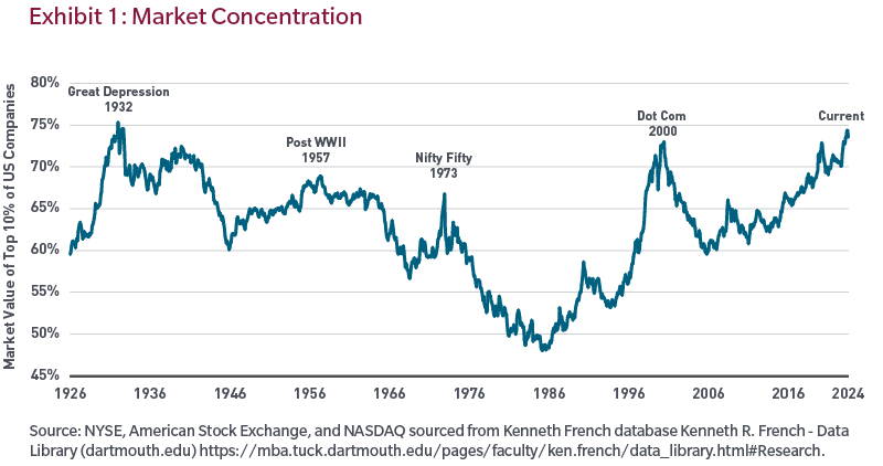
It’s worth noting that concentration peaks don’t always occur at the same point of a market cycle. For example, some have occurred within relative proximity to market peaks as investors crowd into favoured stocks (1973, 2000) whereas some occurred near market troughs (1932, 1957).
What next?
Markets move in cycles. Just like value versus growth, large versus small, or US versus non-US, concentrated versus diversified is another type of cycle for investors to consider. As shown above, markets do eventually reach a concentration tipping point where they revert to broader participation. If there is some degree of willingness to accept the premise that, at some point, the regime will shift to a less concentrated and more diversified environment, how long can that unwind last, and what does that entail for various segments of the equity market?
Using the concentration peaks listed in Exhibit 1, we took a deeper dive on both sides of the peak to examine how long the run-ups preceding the peak can last and how long the ensuing unwind of these concentration cycles can take.
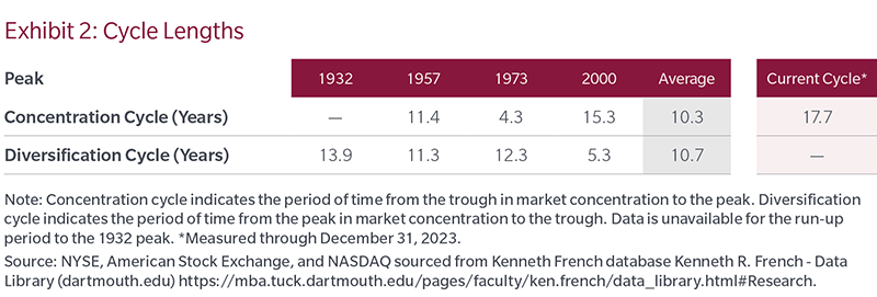
In the concentration periods, markets become more top-heavy and typically favour less diversified approaches. Conversely, post peak, market performance is historically dictated by a wider percentage of stocks and is more favourable to a diversified approach. Though lengths of the cycles favouring concentration versus diversification vary, on average these are long duration events that last about a decade. Even the shortest ones were still four to five years in length, which to many is considered a full market cycle. To put this in context to where we are today, the 2000 diversification period lasted until April 2006. This means the current run-up of concentration is closing in on nearly 20 years, which far surpasses the average. We don’t know when this will end, but we do have empirical evidence that shows us to be at an extreme in both magnitude and length.
As markets ebb and flow, and concentration comes in and out of favour, it can certainly have an impact on other underlying dimensions within the equity landscape. We have seen this over the past many years as large-cap growth has had a huge tailwind versus smaller cap and value segments of the market. Is this typical and what happens when the dynamics shift?
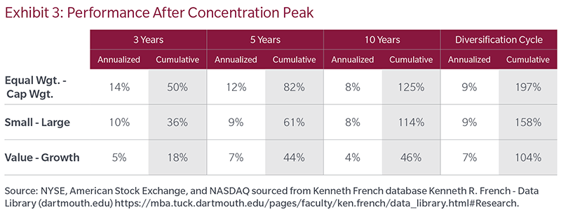
Exhibit 3 displays the average annualized and cumulative results after the peak in concentration over various timeframes for the following: US equal-weighted index less US cap-weighted index; US small cap less US large cap; US value less US growth. The rightmost dataset indicates the average results across the entire diversification cycle, as indicated from a peak to trough in market concentration.
As shown, the better performing areas of the equity market during a diversification cycle are historically the ones that have been the laggards over the past many years — and by a wide margin. Specifically, as shown in Exhibit 3, note the following:
Breadth: Equal-weighted equities significantly outperformed cap-weighted equities. Following periods of excessive concentration, more diversified portfolios (i.e., equal-weighted portfolios) historically outperformed the more concentrated cap-weighed portfolios. This could bode well for active managers who are typically more diversified than the current cap-weighted indices. By definition, traditional passive portfolios carry equivalent allocations to stocks as the indexes they track. With a small subset of highly performing stocks representing a significant percentage of large-cap indices, any pressure on these stocks could subject passive portfolios to substantial downside risk. Active managers have the flexibility to prudently diversify away from the risk of excessive concentration in their benchmarks.
Size: Small caps outperformed large caps. Investors may be leaving returns on the table by not diversifying down the market cap spectrum. Additionally, this may bode well for some active managers given the skew of large-cap indexes as well as the potential opportunity to take active positions in an area of the market that is less covered, less efficient and may possess a greater opportunity to drive value through security selection.
Style: Value outperformed growth. Much like size, investors may be better served by diversifying their style exposures. Clearly growth has had a tailwind recently, but ensuring style diversification can help manage the return profile when growth eventually fades.
Of course no one can perfectly time when concentration will peak, but the encouraging element to note is that it is not critically important in our view. Our analysis showed directionally similar outcomes when measured from a starting point one and two years preceding market concentration peaks. Even if you are early, we believe the benefits of diversification can be meaningful when the cycle turns. Our conclusion here is that ensuring proper diversification is more critical than the actual timing of diversification.
Conclusion – An argument for diversification
Given substantial market strength over the last decade, largely from just one market segment, it’s easy to fall into the trap of forgetting about the benefits of diversification. The history books may describe the theme of the past decade-plus as a period of extreme market concentration and strong performance of a small segment of the investable universe. We don’t know when this regime will end, but the data show evidence that when market leadership changes, the shifts can be as dramatic and persist for just as long — historically benefiting a diversified and active approach.
Endnotes
1 S&P 500 Top 50 – Gross return.
2 Russell 2000® – Total Return.
3 Russell 3000® Growth – Total Return.
4 Russell 3000® Value – Total Return.
5 NYSE, American Stock Exchange, and NASDAQ sourced from Kenneth French database Kenneth R. French - Data Library (dartmouth.edu).
Benjamin R. Nastou, CFA is Co-CIO Quantitative Solutions, Derek W. Beane, CFA is an Institutional Portfolio Manager, and Jonathan Perlman is a Quantitative Sr. Research Associate at MFS Investment Management. The views expressed are those of the author(s) and are subject to change at any time. These views are for informational purposes only and should not be relied upon as a recommendation to purchase any security or as a solicitation or investment advice. No forecasts can be guaranteed. This article is issued in Australia by MFS International Australia Pty Ltd (ABN 68 607 579 537, AFSL 485343), a sponsor of Firstlinks.
For more articles and papers from MFS, please click here.
Unless otherwise indicated, logos and product and service names are trademarks of MFS® and its affiliates and may be registered in certain countries.