Register For Our Mailing List

Register to receive our free weekly newsletter including editorials.

Home / 189

The Dow hitting 20,000 and what it hides

One event that grabbed headlines around the world in late January 2017 was the Dow Jones Industrial Average finally hitting 20,000 for the first time. The ‘Dow’ is the world’s oldest and most widely-followed stock market index but it is also deeply flawed. It only tracks 30 stocks and they are not the largest stocks in the US by any means. The weighting of stocks is almost arbitrary and is based on the nominal share price of each stock and not on their relative revenues, profits, market values or importance. Despite the flaws, it is symbolic and it provides a reasonable proxy for US stocks in general. All other indexes of the US stock market have hit all-time highs recently, so the US market is hot.

Why the Dow is misleading

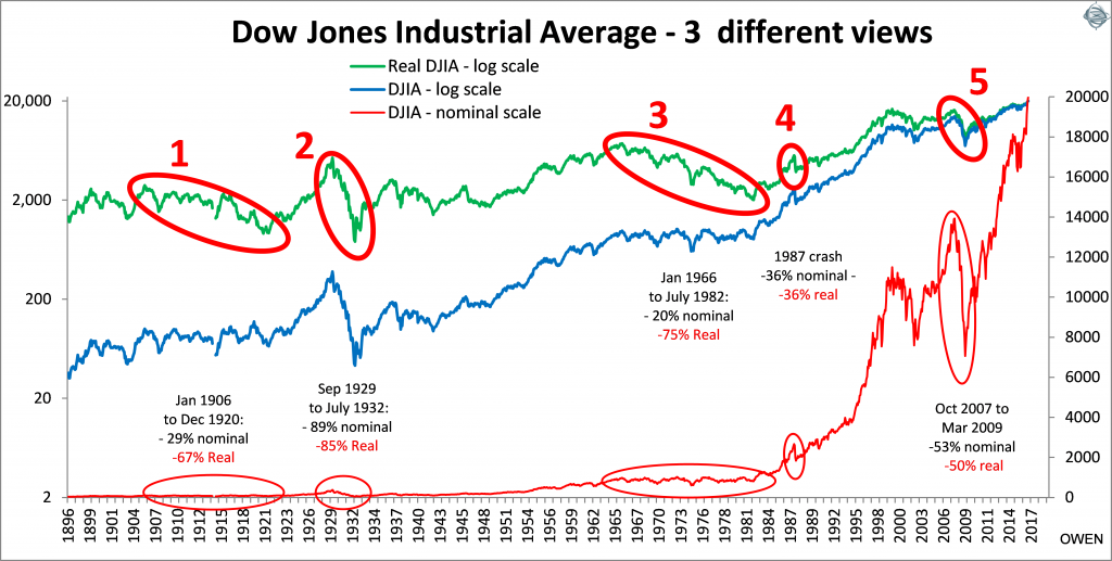
A nominal index like the Dow hides many sins. The red line on the chart below was widely published last week. It shows the Dow virtually flat for 80 years and then the red line surges in the 1990s ‘dot-com’ boom, then again in the 2003-07 credit boom, crash in the 2008-09 sub-prime crisis, and finally make the rapid, steep ascent to the summit since 2009.

Click to enlarge

This traditional view is grossly misleading as it makes the recent cycles appear much more dramatic than earlier cycles due to the nominal scale used in traditional charts (right scale).

We need to add two more lines to see what is really going on. The first is the blue line which is the same nominal index but on a more sensible scale, a ‘log’ scale (or ratio scale) on the left side. This type of scale shows the cycles in the same light. For example, a doubling or halving of the index appears as the same size change regardless of the level of the index at the time.

The blue line shows that the 1929-32 crash (‘2’ on the chart) was much more serious than the 2008-09 sub-prime crash. The index fell -89% in 1929-32, much worse than the -53% fall in 2008-09, but it is almost invisible on the traditional nominal scale chart (red line in lower left).

We also need to add a third line to adjust for inflation (green line, which also uses the left log scale). What matters to investors is the real spending power of their wealth after inflation, and this picture not nearly as rosy. We see that the ‘real’ index after inflation has only gone from 2,000 to 20,000 in 120 years – that’s less than 2% real growth per year on average, which is hardly inspiring. True that doesn’t include dividends, but most investors live off the dividends and rely on the capital value increasing in real terms so that dividends can also keep ahead of inflation.

This inflation-adjusted picture also reveals two more bear markets: ‘1’ was the long bear market from 1906 to 1920 when share prices fell 67% in real terms, and ‘3’ was 1966 to 1982 when the prices fell 75% in real terms. Both of these bear markets lasted an agonising 15 years, much longer than the other crashes, and much worse after inflation than the sub-prime crash, the dot-com crash, and the 1987 crash. Inflation cripples returns and lifestyles for many years at a time.

Australian shares are a long way off their highs

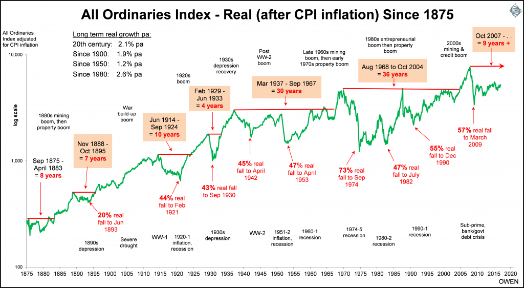
Here is the same chart for Australian shares, using the All Ordinaries index and its predecessors, adjusted for Australian inflation. Using only the real (after inflation) line shows the cycles more clearly. The long picture is similar to the US, with the price index growing by just 2% per year in real (after inflation) terms.

Click to enlarge

The sub-prime crash in 2008-09 was not unusual in the scheme of things. Contrary to the media hype at the time, it wasn’t a ‘once in a century’ event or even ‘once in a lifetime’ event, we have had several declines of similar or worse magnitude, one every decade or so.

Our ‘big one’ was the crash from 1968-74 because we had a much bigger speculative mining bubble in the late 1960s and then a huge debt-fuelled property construction boom in the early 1970s. The All Ordinaries index took 36 years to recover its real value. That’s a long time to wait before seeing any real growth!

Inflation adjustment changes the story

The All Ordinaries index at 5,675 (at time of writing) is just 5% higher (after inflation) than it was at the top of the mining boom on 6 January 1970. Most people who were lured into the speculative mining stocks of the day lost the lot. But what about those who avoided the speculative stocks and thought they were staying safe by buying big blue chip stocks? The so-called blue chips are barely breaking even (after inflation) even today after nearly 50 years!

The big stocks that dominated the index back then are the same companies today. Bank of NSW (now Westpac) is just ahead of its 1968 peak price, but ANZ and NAB are still behind. BHP and Woodside are just above water but CRA (now Rio) and Santos are still well behind. CSR, QBE and Lend Lease are all below their 1960s peaks.

Sure they have paid dividends along the way, but unless we want to keep working all of our lives, the aim is to live off the dividends and see the share price (and dividends) grow ahead of inflation. Timing is everything. If we follow the crowd and the media hype and buy at the top of a boom we could be waiting many decades to get back to square one before we can see any real growth.

The main lesson from the Australian and US charts is that big crashes occur frequently and they can take decades to recover in real terms after inflation. It has now been nine years since the top of the last boom, and prices are still a long way from square one. The aim is to avoid panic buying in boom time frenzies, and avoid panic selling at the bottom when prospects look darkest.


Ashley Owen is Chief Investment Officer at independent advisory firm Stanford Brown and The Lunar Group. He is also a Director of Third Link Investment Managers, a fund that supports Australian charities. This article is general information that does not consider the circumstances of any individual.

6 Comments
Aaron
February 09, 2017

Mark
I agree mostly with your comment but have you checked the last 10 years in Australia?
It didn't happen
According to Bloomberg estimates, the dividend level has risen about 5-10% in total. Inflation is up 26%, so real dividend growth hasn't happened in Australia over that period.
Retained earnings is the key. Higher dividends here constrain the growth. Overseas markets with lower payout ratios grow their dividends more than inflation.

Kevin
February 09, 2017

Reading tap dancing to work (Carol Lumis) Buffett explained the same thing around 1977.He also explained that the wealth is created by reinvesting the dividends,this produces the large growth.BRK going from around $10 to present day $200 odd K.Simply by reinvesting the divi.

While I live off the dividends now it never crossed my mind to think that the same amount of shares would forever produce a rising income and capital growth.Unless a very large amount was invested in the first place.

The last paragraph is perfect.I think it took the dow 50 yrs to return to 1929 levels,Japan is still well below 1990 levels and the ASX may still take a while to reach Nov 2007 levels.However wealth has increased by reinvesting dividends over that period.,so has income.

Martin
February 09, 2017

The charts are excellent and provide an important perspective but surely a long-term return of 2% over inflation in addition to dividends is something investors should (learn to) be satisfied with.

Peter Thornhill
February 10, 2017

The article makes some valuable points on the importance of understanding the impact of inflation on investment returns and capital growth, and yes - inflation is one of the biggest drivers of capital growth and yes, don't think that today's investment market volatility and market highs are too different to what has happened in past history.

However the author perhaps makes the wrong concluding point. Ignoring dividends means he has only seen half the picture. Australian price index returns are roughly 2% lower than the US price index returns, because our dividends are roughly the same amount higher than the US dividend rate. That is, after dividends the return differential between the two markets is negligible.
Furthermore, the most important element is that in both markets investment in equities provided investors with complete protection against inflation over long periods of time. Contrast this with bonds, which on the same after inflation basis, will have lost money over the long term!

Albert
January 28, 2018

Spot on Peter.

The other questions are :

Do fund managers as a group out perform the index ?

How many Fundies have a sufficiently long record of out performance to give you confidence to use them and how long can they live for to keep this up ? Certainly important when you make multi generational investment decisions.


Leave a Comment:

RELATED ARTICLES

History tells us that markets are at a high-risk juncture

How likely are market crashes?

Hedging for capital preservation

banner

Most viewed in recent weeks

Are LICs licked?

LICs are continuing to struggle with large discounts and frustrated investors are wondering whether it’s worth holding onto them. This explains why the next 6-12 months will be make or break for many LICs.

Retirement income expectations hit new highs

Younger Australians think they’ll need $100k a year in retirement - nearly double what current retirees spend. Expectations are rising fast, but are they realistic or just another case of lifestyle inflation?

5 charts every retiree must see…

Retirement can be daunting for Australians facing financial uncertainty. Understand your goals, longevity challenges, inflation impacts, market risks, and components of retirement income with these crucial charts.

Why super returns may be heading lower

Five mega trends point to risks of a more inflation prone and lower growth environment. This, along with rich market valuations, should constrain medium term superannuation returns to around 5% per annum.

The hidden property empire of Australia’s politicians

With rising home prices and falling affordability, political leaders preach reform. But asset disclosures show many are heavily invested in property - raising doubts about whose interests housing policy really protects.

Preparing for aged care

Whether for yourself or a family member, it’s never too early to start thinking about aged care. This looks at the best ways to plan ahead, as well as the changes coming to aged care from November 1 this year.

Latest Updates

Shares

Four best-ever charts for every adviser and investor

In any year since 1875, if you'd invested in the ASX, turned away and come back eight years later, your average return would be 120% with no negative periods. It's just one of the must-have stats that all investors should know.

Our experts on Jim Chalmers' super tax backdown

Labor has caved to pressure on key parts of the Division 296 tax, though also added some important nuances. Here are six experts’ views on the changes and what they mean for you.        

Superannuation

When you can withdraw your super

You can’t freely withdraw your super before 65. You need to meet certain legal conditions tied to your age, whether you’ve retired, or if you're using a transition to retirement option. 

Retirement

A national guide to concession entitlements

Navigating retirement concessions is unnecessarily complex. This outlines a new project to help older Australians find what they’re entitled to - quickly, clearly, and with less stress. 

Property

The psychology of REIT investing

Market shocks and rallies test every investor’s resolve. This explores practical strategies to stay grounded - resisting panic in downturns and FOMO in booms - while focusing on long-term returns. 

Fixed interest

Bonds are copping a bad rap

Bonds have had a tough few years and many investors are turning to other assets to diversify their portfolios. However, bonds can still play a valuable role as a source of income and risk mitigation.

Strategy

Is it time to fire the consultants?

The NSW government is cutting the use of consultants. Universities have also been criticized for relying on consultants as cover for restructuring plans. But are consultants really the problem they're made out to be?

Sponsors

Alliances

© 2025 Morningstar, Inc. All rights reserved.

Disclaimer
The data, research and opinions provided here are for information purposes; are not an offer to buy or sell a security; and are not warranted to be correct, complete or accurate. Morningstar, its affiliates, and third-party content providers are not responsible for any investment decisions, damages or losses resulting from, or related to, the data and analyses or their use. To the extent any content is general advice, it has been prepared for clients of Morningstar Australasia Pty Ltd (ABN: 95 090 665 544, AFSL: 240892), without reference to your financial objectives, situation or needs. For more information refer to our Financial Services Guide. You should consider the advice in light of these matters and if applicable, the relevant Product Disclosure Statement before making any decision to invest. Past performance does not necessarily indicate a financial product’s future performance. To obtain advice tailored to your situation, contact a professional financial adviser. Articles are current as at date of publication.
This website contains information and opinions provided by third parties. Inclusion of this information does not necessarily represent Morningstar’s positions, strategies or opinions and should not be considered an endorsement by Morningstar.