Many of the articles in Cuffelinks and other forums make reference to the impact of different risks on retirement outcomes. The risk factors most commonly mentioned are investment returns and mortality risk. There are many other factors including inflation and wage outcomes and our level of discretionary savings. However the big question remains largely unanswered: given all these risks what is the variability in retirement financial outcomes?
This is a difficult question as there is surprisingly little research on this subject. Both Treasury and Rice Warner project retirement outcomes but only produce point estimates. Point estimates are dangerous pieces of information if used in isolation. They are in effect expectations, yet we know little of the variation around the expectation. For individuals this risk creates false confidence in an uncertain outcome and leaves policy makers in a position where they are uncertain whether all possible retirement outcomes produced by the retirement income system are acceptable.
Simulating the financial outcomes
So I investigated this as the core question of my 2011 academic paper titled “Variability in the Projected Financial Outcomes of Australians.” At the heart of this paper is a large lifecycle model which simulates the financial outcomes of single income households (double income households is extremely complex and a project for another day!). There are two aspects to the model. First, it simulates all the financial aspects of a household through their lifecycle. Second, it introduces variability by allowing some of the factors (for instance, investment returns) to experience random outcomes (around an average). We then simulate outcomes (generally 20,000 for each defined situation) and this provides insight to the variability in possible outcomes.
It is important in this type of research that the model faithfully represents the wealth management actions and exposures of a household. In modelling the working years (the accumulation phase), I assume that we work, earn income, pay taxes, consume, purchase a house, and accumulate savings (in superannuation and other forms). In retirement, we draw down on our accumulated savings, we may receive the age pension (subject to means testing), we may pay tax and we consume to an uncertain age of death. All taxes and other rules associated with income, super and pension are modelled.
I introduce variability into the model by allowing some factor outcomes to have an element of randomness, around an expectation. These factors are real wages, real investment returns, variability in mortality outcomes, and some variability in savings rates across households.
What were the results?
The results are measured in terms of replacement rate outcomes, and more specifically the expenditure replacement rate. An expenditure replacement rate compares what we have available in retirement as a percentage of our pre-retirement expenditure levels (think what you have available to spend as a proportion of your previous gross income less taxes and savings). The results are presented for a female (the ‘standard’ case used by Treasury – male outcomes are quite similar). The modelling considers outcomes based on households experiencing different levels of income (represented as a multiple of AWOTE – Average Weekly Ordinary Time Earnings of approximately $70,000 pa). This is also consistent with how Treasury measures retirement financial outcomes. The distribution of outcomes is presented in the panel diagram below.
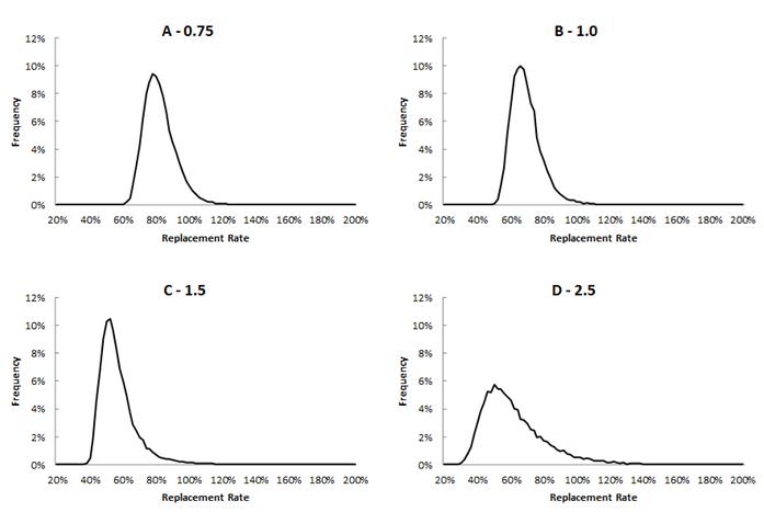
In the diagrams above the number at the top (eg. 0.75 in Panel A) represents the income of the household as a multiple of AWOTE. That is, 75% of $70,000, or about $52,000.
What do we see above? First, it appears that variability is quite large across all households, and is skewed to the right, meaning that surprises are generally to the upside, which is good. This can be explained by the safety net effect provided by the age pension.
We can also see that variability increases as household income increases. This is because high income households generally self-fund a greater portion of their own retirement making them more vulnerable to investment market outcomes.
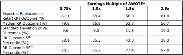
Summary numbers corresponding to the diagrams above are provided in the table below:
How do we interpret this information?
In talking to a high income household earning 250% of AWOTE, we could say that we expect you to have a 61% expenditure replacement rate. They might say that sounds acceptable. Then you should say there is large variability around this estimate and that a 5% worse case event (ie a one-in-twenty likelihood of this or a worse outcome) is an expenditure replacement rate of 38.3% of pre-retirement expenditure. Is this palatable? If not then this variability can be partially managed through the investment and savings decisions we make.
However, a lower income household on 75% of AWOTE should expect an 81% expenditure replacement rate, which falls to a reasonable 68% at the 5% worse case level.
While this research is probably the most detailed in terms of calculating variability, it can always be improved. For instance when I presented this work at a conference it was suggested that I should also have considered the risk to employment outcomes (unemployment risk and the chance of promotion). But as it stands this represents useful information.
Influence of individual risk factors
You may be curious to know which of the individual risk factors contributed most to variability in outcomes. The answer differs by household type. For all households investment risk was the largest contributor to overall variability in outcomes, but especially so for high income households. Household savings rate was important for high income households (high income (top quartile) households are responsible for nearly all of Australia’s household savings (ex-super) and there is a large dispersion of savings amongst households).
Mortality risk has a curious impact across households. For low income households outcomes are improved if you live longer, as relative to inflation the age pension delivers generous indexation which leads to better outcomes the longer you live. However for high income households outcomes are better if you do not live long as you have less chance of exhausting savings and being forced onto an age pension which is well below the level of income you historically experienced.
This research highlights the responsibilities of all in the industry: whether we are policymakers, super funds, wealth managers or financial planners, we are all responsible for contributing to the achievement of retirement outcomes. These outcomes are not just an expectation or a mean: retirement financial outcomes have variability and it is important that this variability is measured, managed for and communicated with those saving for retirement.
It’s useful to focus the mind on how living on 38% of pre-retirement income might affect the plans to travel around the world or build a wooden boat, even if it has only a 5% chance.