The financial press is awash with stories highlighting the correlation between yield curve inversions, in which yields on long-term US government securities fall below the yields on short-term government debt, and recessions. So as an investor, once the curve inverts you’d probably want to underweight equities and overweight Treasuries, right? After all, since 1929 in the US, the S&P 500 Index has declined an average of 33% during recessionary pullbacks, and interest rates usually fall during recessions.
If it were only that simple
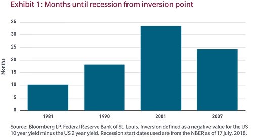
Over the past 60 years, while the curve has inverted in advance of every recession, recording only one false positive, the subsequent onset of recession has sometimes taken years to unfold. For instance, the US economy didn’t fall into recession until about two and a half years after US 10-year Treasury note yields first fell below 2-year note yields in mid-1998. And during that stretch, which included the dot-com bubble, the S&P 500 advanced more than 40%. Clearly, knowing a recession is coming and timing its arrival are two very different things.
Getting the timing wrong can be ruinous, and complicating the equation is the fact that, historically, the curve can invert, uninvert and reinvert again several times preceding recession. For instance, ahead of the 1990 recession, the 2s/10s Treasury curve inverted off and on for over a year. Which of the many inversion signals should investors have focused on? It’s tough to say.
Not your father’s yield curve
Typically, yields on longer-dated bonds, such as 10-year US Treasury notes, are greater than on shorter maturity bills and notes since investors demand to be compensated for locking their money up for longer. But these days, the spread between short-term and longer-term Treasuries is quite narrow. And if the yield curve continues to flatten at its current rate, it won’t be too many more months before the 10-year Treasury note yield falls below the yield on the two-year note. But given years of extraordinary central bank intervention in global bond markets, does today’s yield curve send the same signal as it did in earlier business cycles? We’re not sure it does.
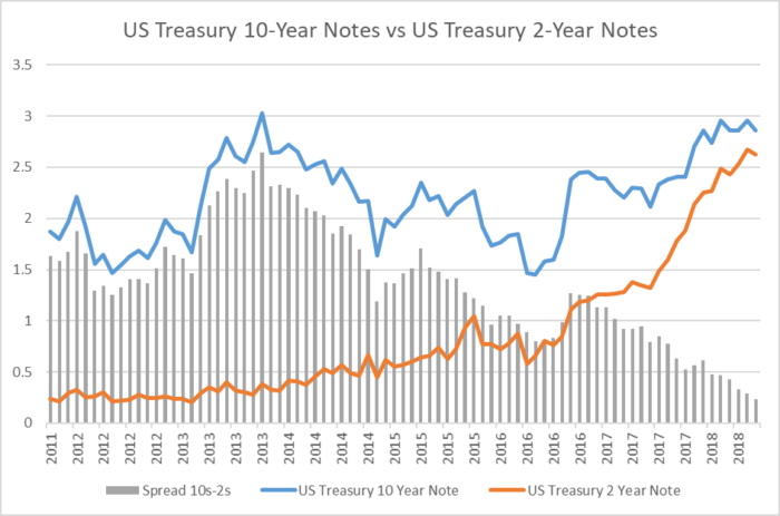
Source: Bloomberg as of 31 August 2018. Click to enlarge.
What causes curves to flatten and sometimes invert? Usually, tighter monetary policy from the US Federal Reserve, since the effects of Fed tightening are much stronger on the short end of the yield curve than on the long end. And flattening of the curve and inversions tend to happen at the end of cycles as the Fed tightens. And cycles, by definition, end in recessions. But it’s a leap of logic to suggest that curve inversions cause recessions. In our view, while there is a correlation there isn’t necessarily causation.
And even if there has been causation in the past, we’d be mindful of Goodhart’s law: When a measure becomes a target, it ceases to be a good measure. In other words, when market participants — including the Fed — become laser-focused on something like the shape of the yield curve, it may no longer be a useful metric.
What’s different this time?
This business cycle is unique when compared with other post-World War II cycles. For starters, our present cycle has been influenced by the Fed’s use of quantitative easing, which resulted in a ballooning of its balance sheet. Many would reason that this build-up, from roughly 5% of GDP prior to the GFC crisis to a peak of nearly 25% of GDP in 2014, has changed the traditional dynamic when it comes to curve inversion. The Fed’s massive asset purchases appear to have reduced term premium, the excess yield that investors demand to commit to holding a long-term bond instead of a series of shorter-term bonds. Fed economists estimate that long-term rates may be 0.75%–1.00% lower today than would otherwise be the case absent the larger-than-normal balance sheet. Some contend that accounting for the amount of quantitative easing and its dampening impact on term premium, the curve would have to invert by 50 to 100 basis points before it would provide the same signal of a subsequent recession as in the past.
That said, each business cycle since the 1980s has displayed unique characteristics with regard to term premium, so we’re not convinced a term-premium-based argument concerning curve inversion is particularly useful in timing the onset of recessions.
Another unique feature of this cycle is that nominal rates are much lower than in prior cycles, so a yield curve inversion may provide a different signal than it did in the past. Some would argue that it’s more difficult to invert the curve when yields on the front end (two years and shorter) — despite rising over the past few years — are still historically low. To illustrate, Japan’s economy, with its super-low interest rates, hasn’t experienced curve inversions ahead of recessions since 1991, though it has fallen into recession seven times since that year.
An additional oddity of our present cycle is that not all sections of the yield curve are behaving similarly. Indeed, the short-end of the curve — from federal funds out to two years — steepened while the more closely-watched 2-years/10-years curve has flattened. We’d be more worried about recession if both curves were inverted. The fed funds/2-years curve is particularly important to the banking system as that part of the curve is where banks make much of their money. Should it invert to the point where banks are paying out more on short-term deposits rates than they are taking in on 2-year loans, the flow of bank credit would likely dry up, constraining economic growth.
Watch the macro
So if investors can’t reflexively rely on the slope of the yield curve to help guide asset allocation, what should they watch? In our view, they should keep a close eye on macroeconomic data. High-frequency data such as purchasing managers’ indices, non-farm payrolls and initial jobless claims, taken together, can help guide decision making more holistically than relying too heavily on a single indicator. These sorts of macro indicators would be good signals to gauge whether the Fed is expected to become overly tight, pushing front-end rates too high, and ultimately resulting in a recession.
Erik Weisman is Chief Economist and Portfolio Manager at MFS Investment Management, a sponsor of Cuffelinks. The views expressed are those of the speaker and are subject to change at any time. These views are for informational purposes only and should not be relied upon as a recommendation to purchase any security or as a solicitation or investment advice from the Advisor.
For more articles and papers from MFS Investment Management, please click here.