Register For Our Mailing List

Register to receive our free weekly newsletter including editorials.

Home / 536

The ASX's 16-year drought: a rebuttal

The All-Ordinaries index hit a peak of 6,853 on 1 November 2007, but it is barely above that 16 years later. Why?

Is the local share market in terminal decline? Has it lost its mojo? Is it ever going to get back to growth? Is it time to give up on the local share market and look elsewhere?

Growth everywhere, but not in share prices

How can share prices remain flat for the past 16 years when, over the same period:

  • The Australian population has grown by 26%
  • The overall Australian economic pie (GDP) has more than doubled in size.
  • The aggregate value of ASX listed companies has increased by 51% (that’s mainly because a lot of shareholder-diluting capital has been raised over the period)
  • Aggregate profits for ASX listed companies have risen by 23%
  • Aggregate dividends have risen by 83%

Despite all of this growth over the past 16 years, why have share prices in aggregate gone nowhere?

Of course, amongst individual stocks, there have been wide variations over the 16 years:

  • there have been some winners (eg. CSL, FMG, Transurban, CBA, Macquarie, Wisetech, JB),
  • some losers (eg. Telstra, WBC, NAB, ANZ, ASX, QBE, all property trusts including Goodman),
  • and many that have gone nowhere (eg. Wesfarmers, Woolworths, Qantas, BHP, AGL).

However, here we are talking about the share market has a whole. Anyone can buy this with a low-cost passive index fund – which would have beaten many ‘professional’ fund managers and individual investors.

(NB – this story relates to price changes – so you need to add dividends of course, including franking credits where applicable.)

Timing is everything!

That headline about 16 years of nil growth is true – but it is only a fraction of the truth. By carefully selecting specific start and end points, you can come with pretty much any story you like!

Those headlines selected 1 November 2007 as the start date because that just happened to be the very top of the pre-GFC credit / China boom, immediately before the GFC crash.

Subsequent returns are always going to be very poor if measured from the tops of wild booms. Big market crashes generally take many years to recover, and the recovery from the GFC crash has been similar to past major crashes.

Pick a different start date, and you get a different story!

Instead of picking the start date at the top of the pre-GFC boom, if we start at the bottom of the GFC crash (6 March 2009 in Australia), then we see that the All-Ordinaries index actually has risen +133% in the 14.7 years up to now.

This is an above-average price gain of 6% per year.

The lesson is simple: if you buy in a wild speculative boom (they are easy to spot at the time), even if you buy a diversified index fund covering hundreds of stocks across all industries, then you will probably have to wait many years to get back to square one.

‘Buy high - sell low’ – history repeats in every cycle

The sad fact is that the tops of wild speculative booms are when hordes of new investors finally pluck up the courage to enter the market. They have been cautiously watching prices rise for several years, and they finally succumb to ‘FOMO’ – the 'Fear Of Missing Out', after seeing their friends and family make 'easy money'.

Equally, after the inevitable crash, in the depths of despair at the bottom of busts, most investors are shell-shocked and can’t bring themselves to buy the very same assets at a fraction of their boom-time prices.

It is hard enough getting people to not to completely sell out at the bottom, which turns temporary price falls into permanent losses of capital.

The charts

The main chart in the first image shows the daily price index since 1920 (All Ordinaries and predecessors). Also in this image are two smaller charts we will cover below.

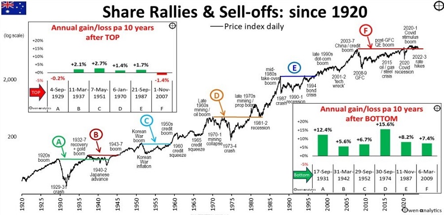
The price index has risen by an average of 5% per year over the past century, but there are no straight lines – ever. There have been a few booms and busts along the way – about once per decade.

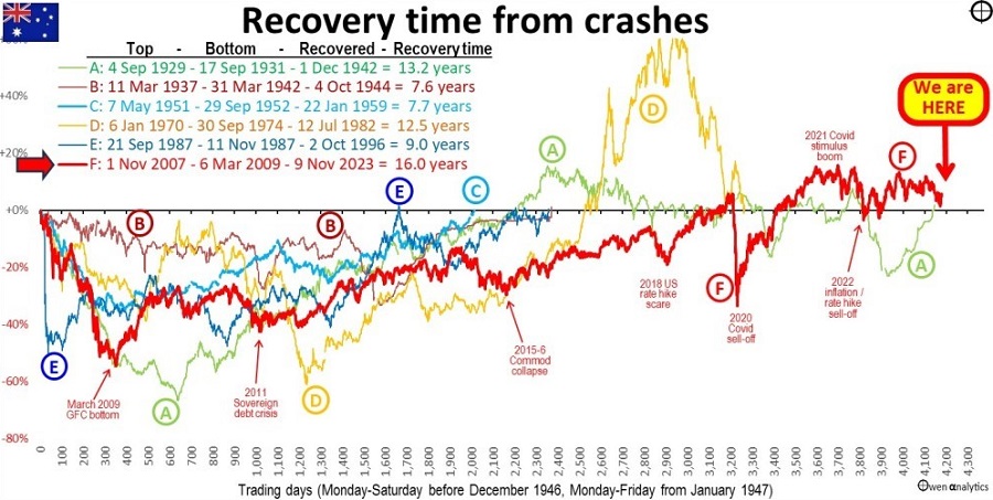
I have highlighted six major busts from which it took many years to recover back to square. From the tops of the booms, it is not unusual to have to wait a decade or more for the market to recover back to the boom-time top.

Each of the cycles is shown from a common start point in the second chart above. In Cycles B, C and E – it took 8 to 9 years to recover boom-time peak prices. In Cycles A, D, and F – prices took more than 10 years to recover (including cycle F, which we are still struggling to recover for good, and put behind us).

Cycle A – the 1929-1931 crash

The 1929-1931 crash at the start of the Great Depression was our deepest market fall, but it was shallower than the US market. Our market started recovering a year earlier than the US market (we were quicker to devalue our currency, we had no banking crisis, and our boom market was less speculative and less over-priced).

The local market recovered its September 1929 high by late 1936 (seven years), but it fell back from early 1937 through to March 1942, in the early stages of WW2. It finally recovered its September 1929 high by the start of December 1942.

Cycle B – the 1937-1942 lead into WW2

The market fell from March 1937 in the lead-up to WW2 but started to rise in April 1942 when the US started to look like defeating Japan in the South Pacific. Prices finally recovered the 1937 high in October 1944, during the WW2 boom. The recovery would have been quicker, but wartime price controls limited share price rises.

Cycle C – 1951-2 Korean War inflation spike

This was a sharp share market fall as the government aggressively tightened fiscal and monetary policy to fight 25% inflation caused by the Korean War and lifting of WW2 price controls.

Cycle D – 1970-1 mining crash + 1973-4 property/finance crash

The double crash was nearly as deep as the 1929-31 crash and took nearly as long to recover 12.5 years), during the stagflation 1970s. Prices had recovered their January 1970 high by September 1979, soared in the 1980-1 mining/property boom but then fell in late 1981 and first half of 1982 in the early stages of the 1981-3 recession. Finally put the January 1970 high behind it in July 1982.

Cycle E – October 1987 crash

This was our sharpest and third deepest crash, and only recovered the September 1987 high nine years later in October 1996.

Cycle F – 2008-9 GFC

This is the one we are still struggling to recover. It included not only the 2008-9 GFC crash, but also some recent selloffs during the recovery:

  • 2011 sovereign debt crisis
  • 2015 China slowdown/commodities collapse
  • Late 2018 US rate hike scare
  • Feb-March 2020 Covid lockdown sell-off
  • and now the 2022-3 inflation/rate hike sell-off

The index actually did recover the November 2007 high a few times in late 2019, but then fell back below square in the Feb-March 2020 Covid lockdown sell-off. It recovered again in December 2020 and rose in the 2021 Covid stimulus boom but fell back below par during the 2022 inflation/rate hike sell-off.

The index has been staying a little above the 1 November 2007 high of 6,853 since 13 October 2022, and almost fell back to it on 31 October 2023. 

If we can put finally move ahead and not retreat to 6,853 again, we will finally rule a line under it and call the cycle over as at 13 October 2022, a fraction under 15 years from the November 2007 top.    

Ten-year returns from different points in time

Below are the two smaller charts that are imbedded in the main chart above. These show the actual price gains/losses over 10-year periods starting from the tops of booms (left chart), and from the bottoms of busts (right).

As expected, the left chart shows virtually nil returns in the 10 years starting from the tops of booms.

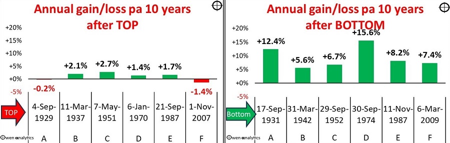
This shows that the current cycle (F) has had very poor 10 year returns from the top, on a par with all the similar prior cycles.

On the other hand, the right chart shows above average returns in the 10 years starting from the bottoms of every one of the busts. When you buy cheap, you get above average returns.

Where are we now?

The current cycle (F) has been a little longer than prior similar cycles, probably because both fiscal policy (government spending/tax policies) and monetary policy (interest rates and QE) were far too loose for far too long – in Australia as well as in the US and elsewhere. This just prolonged and worsened problems and crises.

However, monetary policy is finally being restored to ‘normal’, inflation rates are retreating from their 2021 highs. However, fiscal policy is still loose and inflationary, and global trade and military tensions are rising, so there are a few challenges yet. 

Pricing very different now

The big difference is pricing of the local share market.

The fact that the overall price index has remained flat for 16 years despite aggregate profits for ASX listed companies rising by 23%, and aggregate dividends rising by 83% over the period, tell us that we get 23% more profits, and 83% more dividends per dollar of shares we buy now, compared to what it bought at the top of the pre-GFC boom.

The market was substantially over-priced in 2007, but it is much cheaper now. We are not in a market crash or correction at the moment, so prices are not super-cheap as they were in early 2009 at the bottom of the GFC crash, or in March 2020 at the bottom of the Covid lockdown crash.

However, the market is certainly much better value than it was at the top of the market in 2007, and at the top of the 2021 Covid stimulus boom.

The local share market is not ‘broken’

We have lagged the US market because we don’t have a big tech/online sector. That has taken the US market much higher than ours, but the US will be hit much harder when the boom ends, as they always do. 

You could look at the past decade and a half in two ways:

  • no growth for 16 years if you start from the top of the pre-GFC boom
  • above average growth for 15 years if you start from the bottom of the GFC bust

The first makes for a great headline to scare people. The second is equally true, but good news rarely makes the headline.


Ashley Owen, CFA is Founder and Principal of OwenAnalytics. Ashley is a well-known Australian market commentator with over 40 years’ experience. This article is for general information purposes only and does not consider the circumstances of any individual. OwenAnalytics Newsletter is currently published on LinkedIn. Original article here: ‘Australian share market has gone nowhere for 16 years? Is it ‘broken’? Has it lost its mojo? Will it ever get back to growth? Time to look elsewhere?


16 Comments
Andrew R
November 27, 2023

Thanks, I found both this and the original article interesting reading. The main takeaway for me was not the detailed analysis. Rather, a reminder about basic investment principles eg long-term perspective, dollar-cost averaging into the market, our 'home country bias' for equities, and the importance asset allocation.

richard goers
November 26, 2023

If 5% of stocks make 100% of returns - so 95% of stocks are dogs [most with fleas] then the incentive to look at the 5-10 stocks that make these returns = reward for risk - fund managers wont as they cannot sell a 10 stock portfolio to retail - so the fabulous 5-10 in Australia are known - rebalance every 5 years and also look to replace for the new outliner stocks = also i noted when at a margin equity lender that most portfolios consisted of the fabulous 5-10 on 3 leverage / as well as at CFD broker, share portfolios used the 10 - 20 X leverage so HNW would sell their spot shares and buy the equivalent CFD shares and put 90% of money into property = so somewhat 90% riskless and 10% in leveraged stocks: many ways to skin a cat here but buying stock index ETF as a safe play is well mediocre - the market will reward effort in research =yes more risk but way outside returns

Steve
November 25, 2023

Clearly using a single starting point has issues as outlined. Many people however invest regularly over time for example as their super payments go into their accounts. What would the last 16 years look like with a dollar cost averaging type calculation? e,g. invest $1000/month each month for the last 16 years? I suspect it would trend towards the long term 5% return.
And one more time for my pet peeve - why does no organisation (eg S&P) produce an index that includes franking? It is equally valid as including dividends in a total return index (I call this the Gross return index). Surely the maths is simple and would take minimal effort.........

Dudley
November 25, 2023

"why does no organisation (eg S&P) produce an index that includes franking?":

Like:

'FRANKING CREDIT ADJUSTED DAILY TAX EXEMPT TOTAL RETURN'
https://www.spglobal.com/spdji/en/indices/equity/sp-asx-200/#overview

'Franking Credit Adjusted Total Return Indices'
'Additional total return indices are available for a number of indices in the family, including the S&P/ASX 200 and S&P/ASX 300 that adjust for the tax effect of franking credits attached to cash dividends. The indices utilize tax rates relevant to two segments of investors: one version incorporates a 0% tax rate relevant for tax-exempt investors ...'
https://www.spglobal.com/spdji/en/documents/methodologies/methodology-sp-asx-australian-indices.pdf

Steve
November 26, 2023

Thanks Dudley for that info, much appreciated. What surprises me is that even though S&P produce this index this is the first time I have ever seen it referred to. I would still like to see it used more often rather than the default Total Return index - if you're going to the effort to factor in income (dividends) it seems lazy not to then factor in tax credits at the same time.

For comparison, over the last 10 years (todays date), ASX200 price return has been 2.81% annualised, total return is 7.16%, and adjusting for franking credits (tax exempt) total return increases to 8.69%. Fair difference in perceived performance between a 2.8% annualised return and an 8.69% annualised return!

Dudley
November 26, 2023

Price is useful when about to buy or sell to guess likely price. Don't want dividends distorting view of price.

Total return is useful when comparing longer term rates of return. Don't want absence of dividends distorting view of return.

Both views are about the past. "Que sera, sera."

Shane
November 26, 2023

Great resource Dudley. Finally a set of data that allows a level playing field to compare grossed up returns. Ignoring franking credits in so many of these articles (and the artificially generated capital gains tax by constant trading In managed funds - don’t start me on that hidden cost) is leaving out a considerable % gain to us retired ones in SMSF pension stage.

Dauf
November 29, 2023

Thanks Dudley, great link for us novices…I’ve tried looking before and couldn’t find this

Doach
November 24, 2023

In fairness. Pre GFC the US (DJI) lifted 2.6 times. Post GFC low, 5.45 times. No matter which way you compare it Aust fairs poorly to the US market. Simplistically, economies need inputs to drive GDP. Australia's non-industrial capacity relies up immigration. In the 80's Britain relied upon Tax Havens, to route money into Britain. With the majority of large funds in Australia investing in OS companies (don't blame them), there is a medium term net outflow of Capital from Australia. If ALL that money were invested in Aust we would have a far more favorable outcome in our capital markets.

SGN
November 24, 2023

Hi Ashley
An excellent response with well applied explanation's. Well done .
The original article lacked reasoning

Max
November 23, 2023

An excellent response to the original article.
It goes to show that timing the entry point into the sharemarket delivers a better outcome than time in the market.
You also need to consider that investment into an Index Fund will give you an ordinary result , whereas being selective with timing of entry points with great Businesses and highly likely to give you superior results. The entry price of any Investment determines your future returns and the lower that entry price the higher your future returns will be - it's all really to do with commonsense and patience, but not all Investors are disciplined in that regard.

Jeff Oughton
November 23, 2023

Yes -timing - so buy low sell high -

But it comes to a small number of days and stock picking....

So still also needs a diversified portfolio for the medium to long term

And few (active/TAA) managers have a sustained track record and miss the relatively small number of days that provide excess returns.

Most investors are "disappointed" when picking "bottoms".

Sean
November 23, 2023

A good read, thanks Owen.

Aussie HIFIRE
November 23, 2023

Good rebuttal Owen. As anyone who knows anything about statistics can tell you, if you choose the right dataset then you can "prove" whatever you want.

There's no such thing as a neutral timeframe over which to measure the performance, but it would at least be less biased to use a round number of years like 10 or 20 to show the performance of the market.

It would also be good to show the performance including dividends, particularly given they make up such a substantial portion of the returns for the Australian market. If franking credits could be included that would be even better.

Koach
November 23, 2023

If you look at the accumulation index which assumes dividends are reinvested, then total shareholder return on the index is nearly 100% since 2007

Aussie HIFIRE
November 23, 2023

And if I recall correctly the accumulation index doesn't include franking credits which would add another 1-1.5% per year, so another 20%-35% potentially.


Leave a Comment:

RELATED ARTICLES

Even Warren Buffett lost his edge 20 years ago

How likely are market crashes?

The BIG picture: portfolios perform for the passive and patient

banner

Most viewed in recent weeks

2024/25 super thresholds – key changes and implications

The ATO has released all the superannuation rates and thresholds that will apply from 1 July 2024. Here's what’s changing and what’s not, and some key considerations and opportunities in the lead up to 30 June and beyond.

Five months on from cancer diagnosis

Life has radically shifted with my brain cancer, and I don’t know if it will ever be the same again. After decades of writing and a dozen years with Firstlinks, I still want to contribute, but exactly how and when I do that is unclear.

Is Australia ready for its population growth over the next decade?

Australia will have 3.7 million more people in a decade's time, though the growth won't be evenly distributed. Over 85s will see the fastest growth, while the number of younger people will barely rise. 

Welcome to Firstlinks Edition 552 with weekend update

Being rich is having a high-paying job and accumulating fancy houses and cars, while being wealthy is owning assets that provide passive income, as well as freedom and flexibility. Knowing the difference can reframe your life.

  • 21 March 2024

Why LICs may be close to bottoming

Investor disgust, consolidation, de-listings, price discounts, activist investors entering - it’s what typically happens at business cycle troughs, and it’s happening to LICs now. That may present a potential opportunity.

The public servants demanding $3m super tax exemption

The $3 million super tax will capture retired, and soon to retire, public servants and politicians who are members of defined benefit superannuation schemes. Lobbying efforts for exemptions to the tax are intensifying.

Latest Updates

Retirement

Uncomfortable truths: The real cost of living in retirement

How useful are the retirement savings and spending targets put out by various groups such as ASFA? Not very, and it's reducing the ability of ordinary retirees to fully understand their retirement income options.

Shares

On the virtue of owning wonderful businesses like CBA

The US market has pummelled Australia's over the past 16 years and for good reason: it has some incredible businesses. Australia does too, but if you want to enjoy US-type returns, you need to know where to look.

Investment strategies

Why bank hybrids are being priced at a premium

As long as the banks have no desire to pay up for term deposit funding - which looks likely for a while yet - investors will continue to pay a premium for the higher yielding, but riskier hybrid instrument.

Investment strategies

The Magnificent Seven's dominance poses ever-growing risks

The rise of the Magnificent Seven and their large weighting in US indices has led to debate about concentration risk in markets. Whatever your view, the crowding into these stocks poses several challenges for global investors.

Strategy

Wealth is more than a number

Money can bolster our joy in real ways. However, if we relentlessly chase wealth at the expense of other facets of well-being, history and science both teach us that it will lead to a hollowing out of life.

The copper bull market may have years to run

The copper market is barrelling towards a significant deficit and price surge over the next few decades that investors should not discount when looking at the potential for artificial intelligence and renewable energy.

Property

Global REITs are on sale

Global REITs have been out of favour for some time. While office remains a concern, the rest of the sector is in good shape and offers compelling value, with many REITs trading below underlying asset replacement costs.

Sponsors

Alliances

© 2024 Morningstar, Inc. All rights reserved.

Disclaimer
The data, research and opinions provided here are for information purposes; are not an offer to buy or sell a security; and are not warranted to be correct, complete or accurate. Morningstar, its affiliates, and third-party content providers are not responsible for any investment decisions, damages or losses resulting from, or related to, the data and analyses or their use. To the extent any content is general advice, it has been prepared for clients of Morningstar Australasia Pty Ltd (ABN: 95 090 665 544, AFSL: 240892), without reference to your financial objectives, situation or needs. For more information refer to our Financial Services Guide. You should consider the advice in light of these matters and if applicable, the relevant Product Disclosure Statement before making any decision to invest. Past performance does not necessarily indicate a financial product’s future performance. To obtain advice tailored to your situation, contact a professional financial adviser. Articles are current as at date of publication.
This website contains information and opinions provided by third parties. Inclusion of this information does not necessarily represent Morningstar’s positions, strategies or opinions and should not be considered an endorsement by Morningstar.