Register For Our Mailing List

Register to receive our free weekly newsletter including editorials.

Home / 543

Breaking down 2023 returns for the ASX

2023 was a good year for the Australian share market, but where does it sit in historical terms?

The past five years were actually rather boring and ho-hum for the share market – despite a host of extreme events like the Covid lockdowns, steep recessions, inflation spikes, aggressive rate hikes, wars, rising military tensions, bank collapses, etc.

Here are our Annual Return Pyramids for the Australian share market.

This first chart shows total returns (ie capital gains plus dividends) from the broad Australian share market per calendar year since 1900. The returns are organised in 5% bands – from the worst years at the left through to the best years to the right.

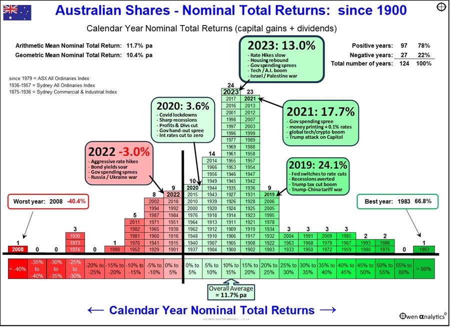
Although the market has returned an average of more than 11% per year overall, the returns each year have ranged from very deep negative years to very large positive years. 

The worst year was 2008, with a return of minus 40%, in the depths of the 2008-9 ‘Global Financial Crisis’ triggered by the US sub-prime collapse. The 2008 negative year came after five consecutive years of strong gains in the 2003-7 China/credit boom.

The best single year was 1983, with a return of +67% in the tremendous rebound out of the 1981-3 recession, which had caused negative years in 1981 and 1982.

Very high positive returns and very low negative returns are relatively rare.

Most of the years are bunched in the ‘boring’ middle third of the chart. 39% of all years were between 10% to 20% range.

One thing that stands out is that the great majority of years have been positive for the overall share market.

  • 78% of years were positive
  • 70% of years were above 5%
  • 59% of years were above 10%
  • 40% of years were above 15%
  • 21% of years were above 20%
  • Only 22% of years were negative, 15% were worse than -5%, and only 8% of years were worse than -10%.

Past five years

The chart highlights returns for the past five calendar years.

  • Four out of the past five years were positive, including 2020 with the Covid lockdown recessions
  • 2022 was the only negative year in the past five years, and it was very mild at just -3%.
  • Three out of the past five years were well above average

‘Volatility!’ – what Volatility?

The other notable stand-out from this chart is the fact that these past five years fall into the ‘boring’, ho-hum middle third of the chart, but look what happened during those five years: 

  • Governments locked entire populations in their homes for months on end for the first time in history
  • the sharpest and deepest economic recessions since the 1930s Great Depression
  • soaring inflation everywhere
  • savage interest rate hikes
  • extraordinary new monetary policies and policy errors
  • the first major war in Europe since WW2
  • new wars and flare-ups in the Middle East
  • a new ‘cold’ war between China and the US
  • trade wars, tech wars
  • commodities booms and busts
  • tech booms and busts
  • bank collapses in the US and Europe
  • our main export buyer, China, ground to a halt with the collapse of its main driver of growth - construction

Despite all of this so-called ‘volatility’ and ‘uncertainty’, the local share market sailed through it, staying in the middle section of the chart, avoiding extreme highs and lows on the left and right of the chart.

Real returns after inflation

The above section relates to ‘total returns’ that include price changes plus dividends, but they do not take into account the wealth-destroying effects of inflation. We adjust returns for inflation in the next chart.

Like the previous chart, the returns are organised in bands – from worst years at the left through to the best years to the right.

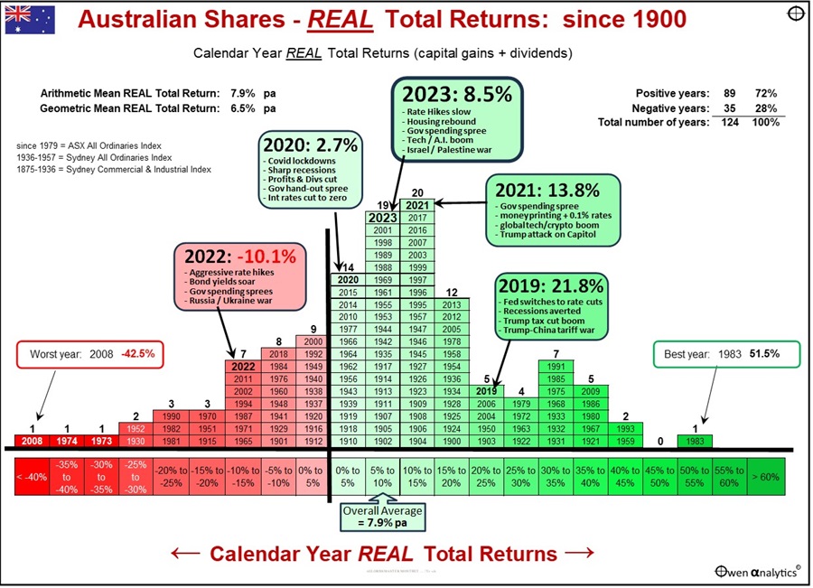
A quick comparison of the two charts shows that the real returns for most years are shifted a little to the left on the scale of return bands (ie lower real returns) compared to the previous ‘nominal’ return chart.

However, there were some years with negative CPI inflation, so ‘real’ returns were higher than ‘nominal’ returns. The years of negative inflation were 1900, 1903, 1904, 1921, 1922, 1924, 1927, 1930, 1931, 1932, 1933, 1944, 1962, and 1997.

Real total returns from the market averaged nearly 8% per year after inflation, compared to more than 11% per year before inflation, because inflation averaged 3.7% per year over the period.  Like the previous chart, real returns each year have ranged from very deep negative years to very large positive years.

The worst year for real returns was still 2008, in the GFC.

The best single year after inflation was also still 1983, despite inflation was running at 10.1% for that year.

Good CPI+ returns

Even after the effects of inflation, the majority (72%) of all years were positive for shares, and 60% of years were better than CPI+5%, ie more than 5% above inflation.

This is a great outcome for investors, and a good reminder that broad share markets are one of the best hedges against inflation.


Ashley Owen, CFA is Founder and Principal of OwenAnalytics. Ashley is a well-known Australian market commentator with over 40 years’ experience. This article is for general information purposes only and does not consider the circumstances of any individual. You can subscribe to OwenAnalytics Newsletter here. Original article is here: ‘Australian Share Market Annual Returns Pyramid


RELATED ARTICLES

Is FOMO overruling investment basics?

Feel the fear and buy anyway

Australia: Most listed stocks per capita and biggest gamblers in the world

banner

Most viewed in recent weeks

Australian house prices close in on world record

Sydney is set to become the world’s most expensive city for housing over the next 12 months, a new report shows. Our other major cities aren’t far behind unless there are major changes to improve housing affordability.

The case for the $3 million super tax

The Government's proposed tax has copped a lot of flack though I think it's a reasonable approach to improve the long-term sustainability of superannuation and the retirement income system. Here’s why.

7 examples of how the new super tax will be calculated

You've no doubt heard about Division 296. These case studies show what people at various levels above the $3 million threshold might need to pay the ATO, with examples ranging from under $500 to more than $35,000.

The revolt against Baby Boomer wealth

The $3m super tax could be put down to the Government needing money and the wealthy being easy targets. It’s deeper than that though and this looks at the factors behind the policy and why more taxes on the wealthy are coming.

Meg on SMSFs: Withdrawing assets ahead of the $3m super tax

The super tax has caused an almighty scuffle, but for SMSFs impacted by the proposed tax, a big question remains: what should they do now? Here are ideas for those wanting to withdraw money from their SMSF.

The super tax and the defined benefits scandal

Australia's superannuation inequities date back to poor decisions made by Parliament two decades ago. If super for the wealthy needs resetting, so too does the defined benefits schemes for our public servants.

Latest Updates

Planning

Will young Australians be better off than their parents?

For much of Australia’s history, each new generation has been better off than the last: better jobs and incomes as well as improved living standards. A new report assesses whether this time may be different.

Superannuation

The rubbery numbers behind super tax concessions

In selling the super tax, Labor has repeated Treasury claims of there being $50 billion in super tax concessions annually, mostly flowing to high-income earners. This figure is vastly overstated.

Investment strategies

A steady road to getting rich

The latest lists of Australia’s wealthiest individuals show that while overall wealth has continued to rise, gains by individuals haven't been uniform. Many might have been better off adopting a simpler investment strategy.

Economy

Would a corporate tax cut boost productivity in Australia?

As inflation eases, the Albanese government is switching its focus to lifting Australia’s sluggish productivity. Can corporate tax cuts reboot growth - or are we chasing a theory that doesn’t quite work here?

Are V-shaped market recoveries becoming more frequent?

April’s sharp rebound may feel familiar, but are V-shaped recoveries really more common in the post-COVID world? A look at market history suggests otherwise and hints that a common bias might be skewing perceptions.

Investment strategies

Asset allocation in a world of riskier developed markets

Old distinctions between developed and emerging market bonds no longer hold true. At a time where true diversification matters more than ever, this has big ramifications for the way that portfolios should be constructed.

Investment strategies

Top 5 investment reads

As the July school holiday break nears, here are some investment classics to put onto your reading list. The books offer lessons in investment strategy, financial disasters, and mergers and acquisitions.

Sponsors

Alliances

© 2025 Morningstar, Inc. All rights reserved.

Disclaimer
The data, research and opinions provided here are for information purposes; are not an offer to buy or sell a security; and are not warranted to be correct, complete or accurate. Morningstar, its affiliates, and third-party content providers are not responsible for any investment decisions, damages or losses resulting from, or related to, the data and analyses or their use. To the extent any content is general advice, it has been prepared for clients of Morningstar Australasia Pty Ltd (ABN: 95 090 665 544, AFSL: 240892), without reference to your financial objectives, situation or needs. For more information refer to our Financial Services Guide. You should consider the advice in light of these matters and if applicable, the relevant Product Disclosure Statement before making any decision to invest. Past performance does not necessarily indicate a financial product’s future performance. To obtain advice tailored to your situation, contact a professional financial adviser. Articles are current as at date of publication.
This website contains information and opinions provided by third parties. Inclusion of this information does not necessarily represent Morningstar’s positions, strategies or opinions and should not be considered an endorsement by Morningstar.