Stock markets around the world crashed in response to the COVID-19 pandemic. Bad would be an understatement, but such falls are not without precedent. Many of today’s market traders probably weren’t born in October 1987, when the stock market dropped by over 40%. However, the GFC won’t be such a distant memory, when the equity market was down by 40% for 2008.
While no one predicted a global pandemic, many were nervous about equity levels before the crash occurred. Investing in 'risk' assets like equities is, by definition, risky. Downturns are expected, and history has shown they are more than compensated for by good returns in subsequent periods.
In this article, we analyse the effect of the market volatility on superannuation funds. In particular, we examine which funds achieved good relative performance both when the markets were strong and in more volatile periods.
Recent fund performance
Last year was good for superannuation investors, with the average fund (as measured by SuperRating’s SR50 Balanced) returning 14.7% for 2019. The top 10 performers earned over 16.5%, as highlighted in Table 1. The table then tracks their performance in the downturn of the March 2020 quarter and the bounce back in April.
The performance of the highest returning funds for 2019 was mixed in the March quarter of this year. They averaged a return of -10.4% for the three months, no better than the average fund, highlighting the danger of choosing a fund based on short-term performance.
With markets again strongly positive in April, some funds bounced back, while others continued to lag.
UniSuper and smartMonday both had great returns in 2019, were near the bottom of the peer group for the March quarter, and then back to the top in April. In contrast, LGIA and First State Super were near the top of the peers for the quarter but then lagged when markets bounced back in April.
None of these funds was above median over all three periods. Cbus was the only fund in SuperRatings SR50 balanced universe which managed to achieve that outcome.
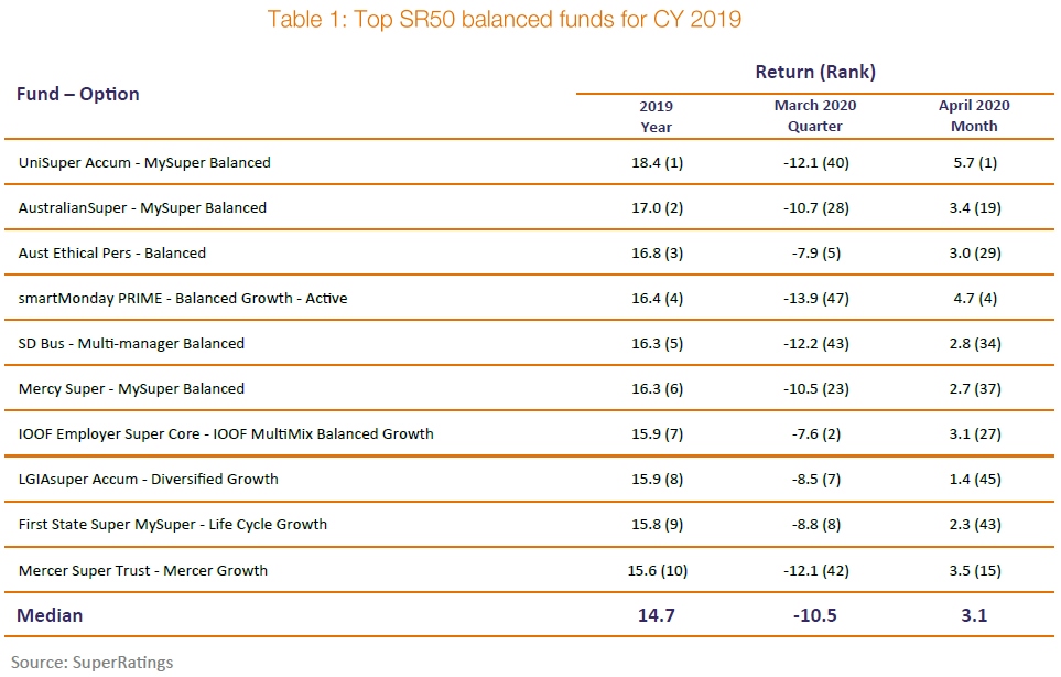
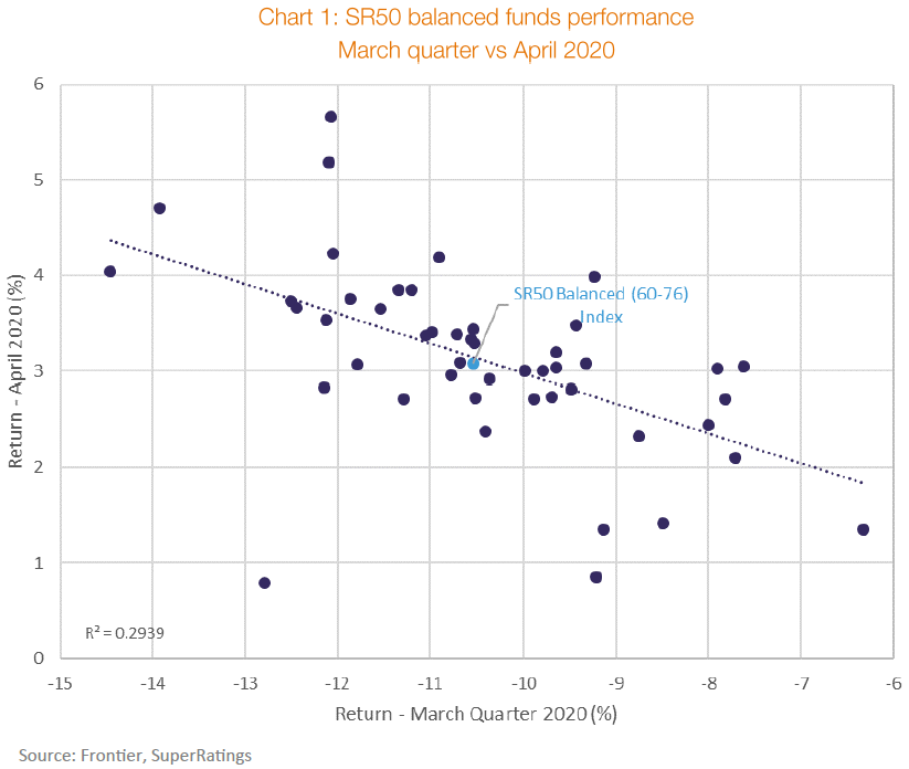
Chart 1 below highlights the universe of all SR50 Balanced funds with their performance for the March quarter compared to their return in April 2020.
The upper right quadrant of the chart is the best place to be, outperformance in both periods. The place to avoid is the bottom left quadrant, underperformance in both periods. As can be seen, these are the quadrants with the fewest funds – just six outperformers in both periods and five underperformers.
Most funds, perhaps unsurprisingly, outperformed in one period and then not the other.
This is highlighted by the trend line in the chart, showing a strong negative correlation between performance in the two periods.
Any fund which was running higher risk than peers will have performed well in 2019, poorly in the March quarter and then well in April. These funds appear in the top left of Chart 1. For these funds, this greater risk may explain some of their good historic performance.
Similarly, those funds which had less risk will have struggled in 2019, performed well in the March quarter and then lagged again in April. These funds are in the bottom right of Chart 1.
Longer-term performance
While interesting, there is a danger in reading too much into short-term performance.
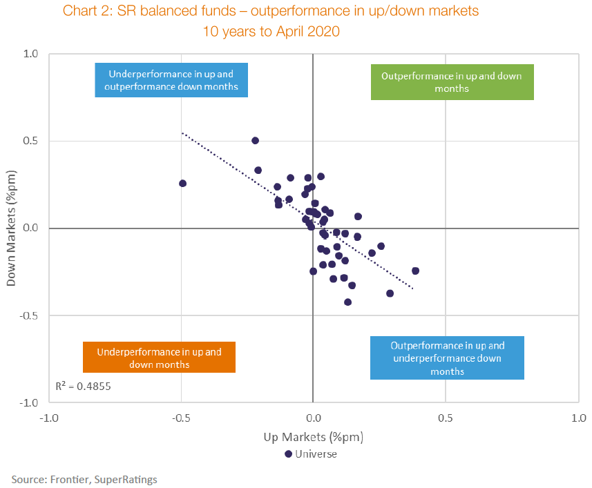
The analysis in Chart 2 considers the performance of balanced funds over the past 10 years. Every month is classified as an 'up' month or a 'down' month dependent on whether the median fund was above/below CPI +3% pa (calculated monthly). An individual fund has outperformance in an up month if it then exceeded the median fund (SR50 Balanced) in that period (and vice versa).
Chart 2 shows most funds are close to zero. That is, on a monthly basis, they neither out nor underperform by too much. This is expected. A fund that consistently outperformed by +0.5% each month would exceed the median fund over a year by more than 6%.
Most funds either:
- Outperform in up markets and underperform in down markets (40% of funds), achieved by taking more risk than the average fund, or
- Underperform in up markets and outperform in down markets (33%), achieved by taking less risk than the average fund.
Being higher risk or lower risk is neither a sign of a 'good' nor a 'bad' fund by itself. It may be that the fund has explicitly taken this approach in response to the demographics of its membership.
Again, it is noteworthy that there are few funds that outperform in both up and down markets. Fortunately, there are no funds that consistently underperform in both market conditions.
Risk prediction
At Frontier, we examined various metrics to understand the risk level different funds were taking. In this section we consider two of those measures:
- Growth/defensive assets ratio - a simple measure used in APRA’s heatmap calculation, and
- Standard deviation - the traditional investment risk measure.
An important characteristic of any risk metric is predictive. Does it provide early warning signals?
In normal periods, when markets are rising, we expect funds with higher risk to produce higher returns. However, in negative markets, we would expect higher risk funds to perform worse.
To test the predictive power of the two risk measures above, we compare the risk result for each measure against each fund’s performance in the March 2020 quarter. If the risk measure has predictive power, it should show those funds with a higher risk performed worse in the March quarter than those with a lower risk.
As expected, there is a negative relationship between a fund’s growth/defensive ratio and its performance in the March quarter. However, the relationship is not strong. There are many funds with high ratios which performed relatively well in March, outperforming funds with lower growth exposure. Indeed, the two worst performing funds over the quarter had growth ratios in line with the average fund.
Using standard deviation of returns as the risk measure reveals a negative relationship between the risk measure and the return for the March quarter. But in this case, the relationship is much stronger. The funds with the highest standard deviation are those with the worst performance, and those with the lowest standard deviation had the best performance.
There are still exceptions to the rule, with a few funds performing well despite an average level of risk. However, standard deviation was a considerably better predictor of a fund’s outcome in the March quarter than the fund’s growth/defensive ratio. This is expected given five-year and March quarter performance were both largely driven by listed equity market behaviour, although a faster shift in unlisted asset valuations during COVID-19 compared to prior stressed periods is a noteworthy development.
APRA heatmap used to assess fund performance
APRA has identified the need to assess investment performance on a risk—adjusted basis to ensure differences across superannuation fund strategies are considered. They have chosen is the growth/defensive ratio as a proxy for risk.
APRA’s heatmap was released in December 2019, based on performance to June 2019. The three and five years to June 2019 were 'normal' markets where risk was rewarded with higher returns.
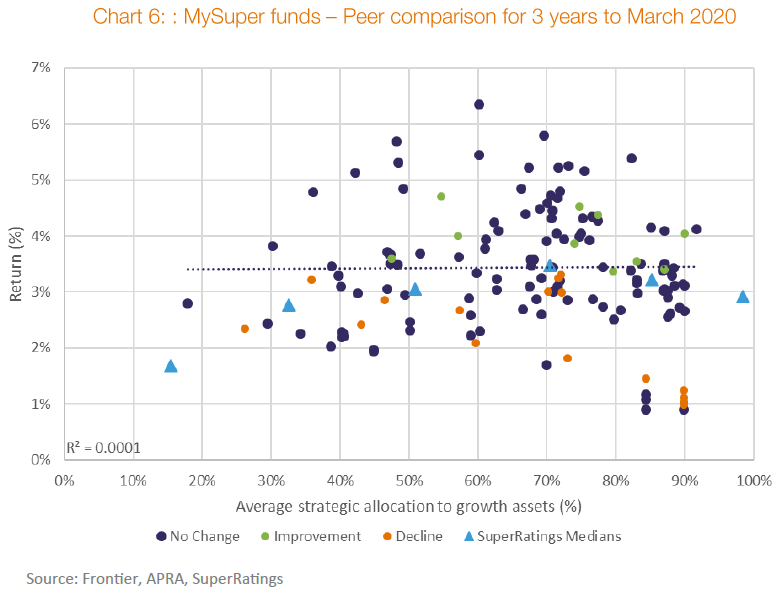
Chart 5 shows one of the heatmap metrics, comparing the growth/defensive ratio (as defined by APRA) against performance for each MySuper fund.
This chart shows a strong, positive correlation between risk and return.
Any fund with performance above the trend line in Chart 5 received a 'white' heatmap outcome for this metric. A fund below the line received a red or yellow outcome, depending on the extent to which they underperformed peers.
We noted in our previous paper that another characteristic of a good risk measure is that it is comparable both between different entities and over time. APRA also identified an aim of the heatmap was to improve transparency, providing “credible, clear and comparable information for all MySuper products”.
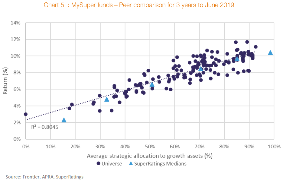
Chart 6 updates this heatmap calculation to March 2020, taking into account the fall in markets since. Unlike Chart 5, Chart 6 shows no relationship between risk (as measured by the growth/defensive ratio) and return. Over the latest three-year period, the growth ratio was not influential in determining a fund’s peer relative return.
If APRA was to recalculate their heatmap metrics as at March 2020, those funds below the trend line would receive yellow or red ratings.
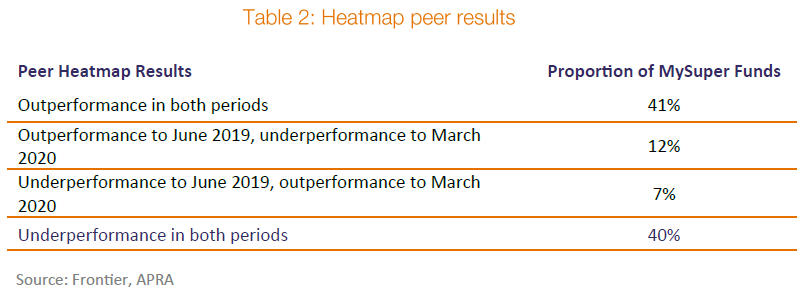
Despite only nine months elapsing between the two calculation dates, funds will have moved from outperforming to underperforming and vice versa. Based on this analysis, almost one in five of funds will have changed its assessment on this metric.
The final word…
The recent market volatility has provided a good opportunity to better understand the true risk levels that different funds are taking. Funds which were merely taking more risk than peers will have performed poorly in the March quarter and then bounced back in April. Lower risk funds should have had good relative performance in the March quarter and then lagged in April. Few funds managed to produce good performance in both periods.
Similar results are found over longer periods. Very few funds perform well in both good and bad market conditions.
This has important implications for assessing the performance of funds.
In strong market periods such as we had seen up until earlier this year, those funds which are taking more risk will look better than peers. However, the results change when markets experience downturns like those we have seen recently.
While the APRA heatmap aims to create a risk-adjusted assessment of relative fund performance, this period highlights how difficult that can be using a single, indicative measure of risk.
Naively assessing funds’ performance without a deep understanding of risk levels can lead to the wrong conclusions.
David Carruthers is a Principal Consultant for Frontier Advisers. A full copy of this report can be accessed here. This article is general information and does not consider the circumstances of any investor.