The 2016 calendar year started with seven down days in a row for the Australian stock market index, falling nearly 7%. As expected, this triggered the usual scaremongering chatter in the populist media, and the so-called ‘financial’ media in particular. Self-proclaimed ‘experts’ argued the bad first seven days points to low returns and high volatility in 2016.
What should serious investors read into this? Nothing actually. It is easy to demonstrate that warnings about the poor start are nonsense and not supported by evidence or analysis.
No relationship to full year returns
Historically there has been no statistical relationship between returns in the first seven days of a year and returns for the whole year. Likewise, for the first five days, six days, or any number of days.
The first chart shows the price index returns for the first seven trading days of each year (horizontal scale) versus the subsequent return for the full calendar year (vertical scale). The chart uses the Australian All Ordinaries index since 1979 and the Sydney All Ordinaries and its predecessors back to the end of WW2.
The dots (years) are scattered all over the chart in no apparent pattern. The dotted ‘trend’ line is almost horizontal, which indicates that there is no statistical correlation. The top right-hand segment of the chart shows that in some years great returns in the first seven days did indeed turn into great returns for the whole year – eg 1983, 1986, 1980 and 1979. Conversely, the bottom left-hand segment shows years where negative returns in the first seven days turned into negative returns for the whole year – eg 2008, 1982, 1970 and 1965. So far so good.
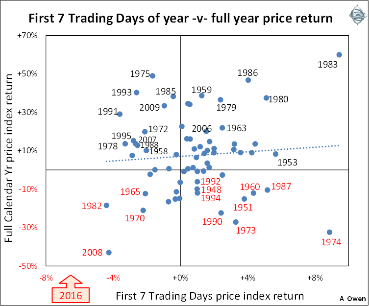
But there are just as many examples when this neat pattern did not work. The bottom right segment shows that in several years, good early returns turned into negative returns for the whole year – 1974, 1973, 1990, 1951, 1960, and 1987. Yes, the 1987 crash year started off well, up 5%. Likewise 1974, the year of the great property finance crash, started the year up an incredible 9%, but the market crashed 52% between March and September 1974.
Likewise, the top left segment shows there were several years when negative returns in the first seven days turned into high returns for the whole year – eg 1991, 1993, 1975, 2009, 1972, 1995, and 2007.
So investors should not read anything into returns for the first few days of any given year.
Is there an Australia Day effect?
After the poor first seven days of 2016, the market recovered a little to Australia Day, but was still down 5.4% over the first 16 trading days to 26 January. Since the national holiday is another chance to pause and reflect on our investments, it begs another question – are returns in the first 16 days a guide to the subsequent returns for the rest of the year? The answer is once again ‘no’.
The next chart shows the price index returns for the first 16 trading days of each year (horizontal scale) versus the price returns for the rest of the calendar year (vertical scale).
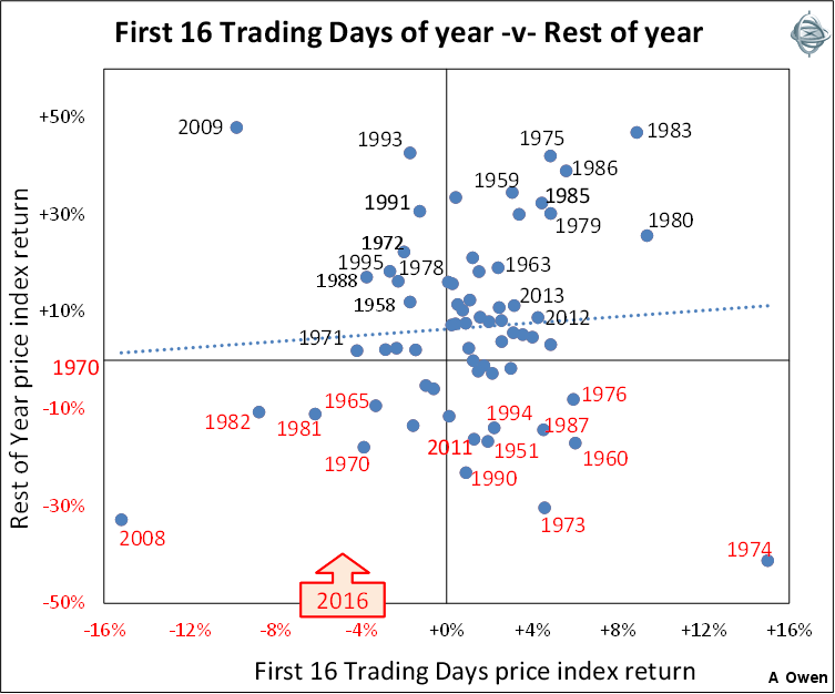
Again there is no pattern here. In several years, poor initial returns were followed by poor returns for the rest of the year, while in other years, good initial returns paved the way for good returns for the rest of the year. But in several years, poor initial returns were followed by high returns. These were mainly the great rebound years – which often started off poorly – eg 2009, 1993, 1991, 1972, 1995 and 1988 – in the top left segment.
Likewise, in several years good initial returns were followed by poor returns for the rest of the year – notably the 1974 crash year, the 1987 crash year, the 1951 Korean War inflation crash year, the 1960 credit squeeze crash year, the 1994 bond crisis year, and other years in the lower right segment.
No relationship to volatility either
The other theme that has appeared in the media in the first few days of this year has been the usual ‘these volatile times’ nonsense that help to sell newspapers, and by brokers generating commissions. The run of down days at the start of 2016 somehow points to a ‘volatile’ year ahead.
This, too, is not supported by the evidence. The past four years have seen unusually low volatility in stock markets. Markets certainly were volatile in 2008-2009 (sub-prime crisis) and 2011 (Greece 2 and US downgrade crises), but have been relatively calm in the four years since then.
Our next chart shows the price index returns for the first seven trading days of each calendar year for the Australian market (horizontal scale) versus the subsequent full year annualised volatility of the price index since WW2 (vertical scale).
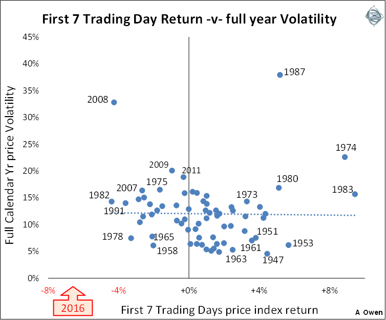
Again we see that the dots (years) are scattered all over the chart in no clear pattern. Once again the dotted ‘trend’ line is almost horizontal, indicating that there is no statistical correlation between the initial first seven days and how volatile the index turned out to be for the full year.
The top left-hand segment of the chart shows that in some years negative early returns did indeed turn into volatile years for the index – eg 2008, 2009, 2007, and 1975. Conversely, the bottom right segment shows years where positive early returns turned into low volatility for the whole year – eg 1953, 1947, 1963, and 1961.
However, the top right segment shows good early returns turned into highly volatile years – eg 1987, 1974, 1980, 1983. The most volatile year in the history of our stock market, 1987, started off with a nice +5% return in the first seven days.
Is a run of eight down days unusual?
If we also include the negative day on the last trading day of 2015, that makes eight consecutive down days – which also makes for catchy headlines. The problem is that eight day runs (of consecutive up days or down days) are not unusual at all, with 79 such runs or longer since WW2.
The longest run of consecutive down days was 16 days in Australia in July-August 1952 during the post-Korean War inflation crisis. Notably, that 16-day run marked the end of the 1951-1952 crash and the start of the subsequent three-year bull run for shares. Investors who were scared off by the record-breaking down run would have missed out on the start of a three-year bull run.
Conclusions
Investors should never base decisions on just a handful of days trading. Bad short-term returns often give rise to unjustified fears and misguided knee-jerk responses, which inevitably lead to bad long-term decisions. Conversely, good short-term returns tend to breed complacency and unfounded optimism, which can be equally damaging to long-term returns.
The added problem is that investors (myself included) have extra time over the holidays to review portfolios. The risk is that if we base our thoughts on the end of year balances we fall into the trap of thinking we have to re-do the numbers because the market has fallen 7% in the first seven days of the new year. The better approach is to ignore short-term moves and keep the focus firmly on the fundamental drivers of long-term performance.
This is the case even with extreme price moves. For example in the 1987 crash the market index fell 50% in just 19 trading days. But not even that 19-day period would have made a difference to long-term investment decisions. Sensible analysis would have meant you were out of the market or at least under-weight from early to mid-1987 so the impact of the 50% September-October 1987 crash would have been avoided or lessened. The sudden 50% fall did not suddenly make the market ‘cheap’ and therefore a ‘good buy’. The market did not become ‘cheap’ on most fundamental measures until late 1990 or early 1991. This was more than three years later – ample time to assess the market with a cool head and decide when the market was good enough value to start investing again.
The lesson is to not let short-term moves distract attention from thorough research and analysis in long-term portfolios.
Ashley Owen (BA, LLB, LLM, Grad. Dip. App. Fin, CFA) has been an active investor since the mid-1980s, a senior executive of major global banking and finance groups, and currently advises investors and advisory groups in Australia and Asia.