Around a year ago I wrote a commentary for Firstlinks “4 reasons why investment performance comparisons are flawed” which outlined a number of deficiencies in commonly-used comparisons of superannuation fund investment performance. The article offered suggestions aimed at raising the level of analysis and debate in this area.
The release of APRA's 'heatmap' on MySuper funds highlights the question of how to best compare funds. Here is a sample of what the heatmap looks like, with each row representing a fund, judged according to investment performance, fees and sustainability. Dark red is bad, through to white is good.
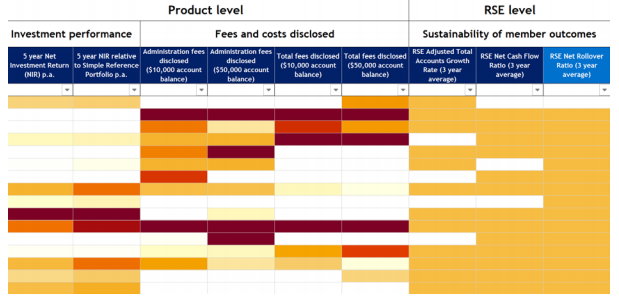
Let’s take a closer look at these three areas.
1. Investment performance
Investment performance is primarily assessed over five years, with three year returns also provided in an ‘Expanded View’. The three relative measures use the following approaches:
- A risk-adjusted return assessment, which compares a fund’s net investment return to an equivalent fund on the growth/defensive spectrum, as determined by a trend calculation as shown in the chart below. This approach is the same suggestion I made a year ago and removes the bias that funds with higher growth assets enjoy when compared with a broad range of funds (for example 60-80% growth assets).
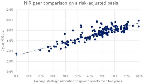
Source: APRA Information Paper, “Heatmap – MySuper products”, November 2019, page 16 (left chart).
- A Simple Reference Portfolio (SRP), which calculates the return for a simple listed growth and defensive portfolio as shown in the first table below, and then applied to a growth/defensive asset split as calculated for each fund using a fund’s growth/defensive breakdown as shown in the second table below.
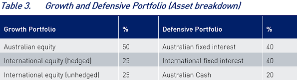
Source: APRA Information Paper, “Heatmap – MySuper products”, November 2019, page 14.
- A listed SAA (SAA) using a fund’s published strategic asset allocation for a fund, and using purely listed passive assets.
A key aspect of the returns analysis is the use of 3- and 5-year timeframes. While a lot better than the 1-year timeframe which the media often focuses on, few MySuper products would use an investment objective that short. Many would use 7- or 10-year timeframes, especially the more growth-oriented products. APRA plans to extend the period over time, test a product over a full market cycle. Lengthening the time frame should be a priority.
In terms of the measures themselves, given that a consistent framework is applied across all funds using published SAAs and using a defined growth/defensive split, they provide a reasonable approach. Importantly they should provide a better like-with-like comparison, based on the growth asset split.
That said, the devil could be in the detail; for example, it will be interesting to see how well the SRP and SAA benchmark returns reflect a fund’s true position (as shown by the difference between the SRP/SAA benchmark and the fund’s own benchmark return calculation).
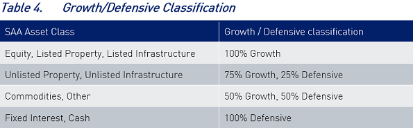
The growth/defensive split classifies unlisted infrastructure and property as 75% growth and 25% defensive. In my experience that is arguably a higher allocation to growth than many would prescribe and will raise the performance benchmark, so some funds will no doubt argue for a greater defensive weighting for these assets. The classification of “Commodities, Other” as 50% growth/50% defensive is curious for commodities, which I believe should be 100% growth, but on average reasonable for alternatives (which includes a wide variety of products from quite defensive to very growth).
To focus attention on underperforming funds and to avoid a ranking system interpretation, the heatmap measures underperformance only (with white colour for all outperformance), down to -0.75% p.a. for the two relative measures. Given the benchmarks used and the time periods, this is fair.
2. Fees
The approach on fees is to calculate both administration fees and total fees (so also including investment management fees) at different levels of fund balances (from $10,000 to $250,000).
Administration fees start at a range of 1.0-1.4% for a $10,000 balance, which falls to 0.2%-0.4% for a $250,000 balance (so the range declines from 0.4% to 0.2%). For total fees, the range is 1.8%-2.2% for $10,000 and 1.0-1.2% for $250,000.
The focus on lower administration fees aims to maintain pressure on funds to be as efficient as possible, which is fair. However, the focus on total fees (once again) emphasises the focus on lower fees. As it is a peer relative measure, funds with higher fees will always be in a negative position. However, high investment management fees in themselves are not a bad thing if they deliver superior investment performance (shown by the net investment return), so the total fees outcome needs to be assessed alongside the net investment return measures. Indeed, some of the results show funds with the highest fees have delivered the best results after fees.
3. Sustainability
There are three so-called ‘sustainability’ metrics - adjusted total accounts growth rate, net cash flow ratio and the net rollover ratio. While I understand the focus on cash flow and other metrics for a fund, it is not clear to me whether these are really a measure of fund performance, or of a fund’s health. Simply because a fund is in cash outflow does not make it a poor performer, rather that it is a reflection of its member base.
Should APRA have gone public?
APRA believes the MySuper heatmap provides a major enhancement to industry transparency and that it gives stakeholders credible, clear and comparable insights. This might be ambitious given the data is delivered in a spreadsheet which many retail users will find hard to navigate.
However, from the perspective of providing an improved comparison of investment performance, the heatmap approach is an improvement, through its use of a consistent methodology for all funds, by comparing funds on a like-with-like basis. There is scope for further improvement, using longer time periods, improved delineation of growth and defensive assets, and adding a measure of drawdown risk for investment performance.
From an overall perspective my concern is how the heatmap will be used. Ever on the outlook for a story, the media will focus on underperforming funds. How will members and trustees of these funds react? If they vote with their feet and exercise their right to switch funds, those funds will arguably be placed in an even worse position, potentially harming remaining members. In the extreme, fund liquidity could be compromised.
Whether APRA and the industry would be better served using the review outcome to privately pressure funds that rate poorly, rather than going public as has been the case, remains to be seen.
Phil Graham is an independent board member and investment consultant. Until August 2018 he was Deputy Chief Investment Officer with Mercer. Some of this article was written using the previous November 2019 APRA Information Paper.