From the 1890s, before the technology to transmit voices was invented, long-distance communication relied on Morse code. It was text encoded in a standardised sequence of dots and dashes transmitted by sound waves, electric signals or visible light. Into the 20th century including radiotelegraphy in World War Two, high-speed international communication used Morse code transmitted on undersea cables, telegraph lines or radio circuits. Today, the US Air Force still trains some air men and women each year to retain Morse skills although commercial use has ceased.
The early days of financial communications were similar. The ticker tape transmitted prices and shares over telegraph lines from as early as 1870 until about 1960. A paper strip of dots ran through a machine called a stock ticker. It was a revolution in its day as it allowed trading floors and newspapers across vast distances to stay on top of market prices.
Now, where each person has a computer in their pocket and with billions of connected devices, 24/7 business channels and a blogger or influencer on every corner, these little dot symbols might signal a past era.
But the ‘dot plot’ has become increasingly important and no more so than today, and what about those little blue and red triangles in the daily newspaper? What do they tell us?
The FOMC dot plot
In 2012, with the GFC still prominent in investor memories, the US Federal Reserve wanted greater transparency regarding what Fed officials were thinking about movements in interest rates. The Federal Open Market Committee (FOMC) ‘dot plot’ was introduced to summarise the opinions of up to 19 Fed officials (seven members of the Board of Governors of the Fed plus 12 regional banks). The dots plotted the outlook for the fed funds rate, the rate at which US banks lend to each other, and an updated dot plot is published quarterly.
The dot plot has become another indicator of potential changes in monetary policy, which the market is eagerly awaiting sometime over 2021 or 2022 with potentially profound implications for prices of all assets. The latest dot plot from June 2021 is below.
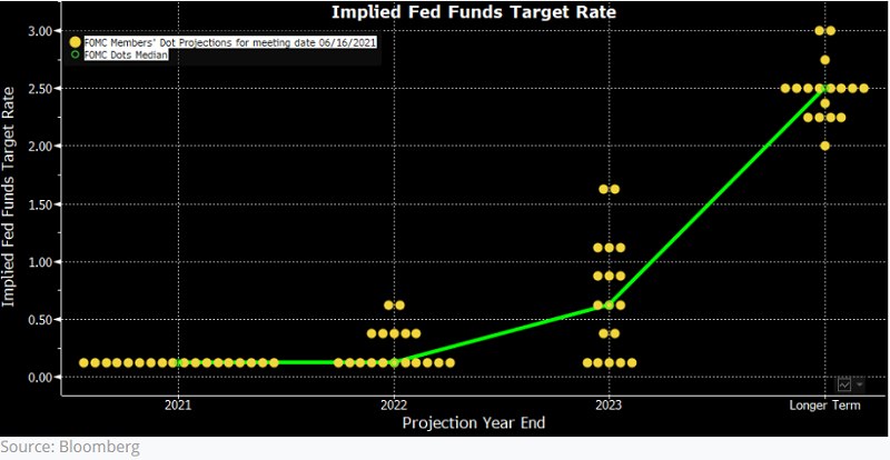
The green dot is the median of the other dots. The messages from the latest dot plot include:
- By the end of 2021, none of the Fed officials expect the fed funds rate to move above the range of 0% to 0.25% (the yellow dots represent the mid-point of the range).
- By the end of 2022, five officials have moved their range up to 0.25% to 0.5%, while two are at 0.5% to 0.75%.
- By the end of 2023, only five remain at the current 0 to 0.25%, while others are higher with three at 1% to 1.25% and two at a wide 1.5% to 1.75%. That puts the median at 0.5% to 0.75%.
- Longer term, everyone is well up, ranging from 2% to 3%.
When comparisons are made with the March 2021 dot plot, more officials expect a hike by 2023, leading the claims of a ‘hawkish’ move in monetary policy. The next meeting of the FOMC is 21 September 2021.
Call that a tantrum?
Fed officials are saying that over the next year or two, the fed funds rate will start to rise, perhaps materially so.
The Fed and the markets hope to avoid the so-called ‘taper tantrum’ of 2013, when in May, Chair Ben Bernanke first talked about ‘tapering’ or reducing bond purchases. Over the years, this tantrum has taken on a fabled life of its own and is often held up as evidence of the risk in raising rates. However, the reaction was not as bad as popularly conveyed, as shown in the chart below. The pull back was less than 6% and then the market recovered strongly for the rest of the year. If that’s a tantrum, bring it on.
The so-called Taper Tantrum of 2013
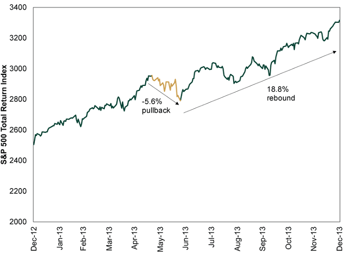
Source: Fisher Investments
The daily stock triangles
In the shape of things, let’s move from dots to triangles.
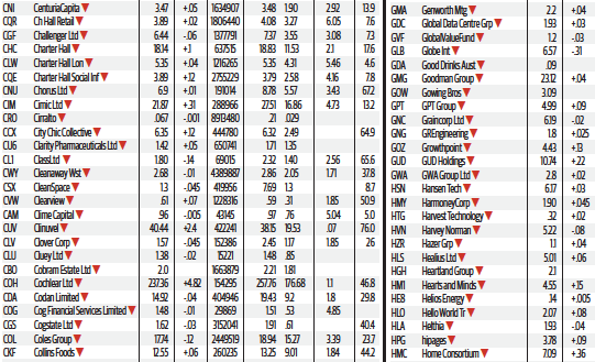
There is a fascinating part in the daily sharemarket tables of the printed version of our major newspapers that I did not notice until recent years. Now I find it compulsive reading every day ... and yes, I like to read the printed version. These tables are harder to find on their websites.
The stock tables include little blue triangles to denote a stock trading at a 12-month high and a red triangle for a 12-month low.
I am not a trader or broker and I do not watch hundreds of stocks every day. These little triangles are a quick check on how the market and particular stocks are performing. Here is an example from last weekend.
Extract from The Sydney Morning Herald, 4 September 2021, Trading Room section
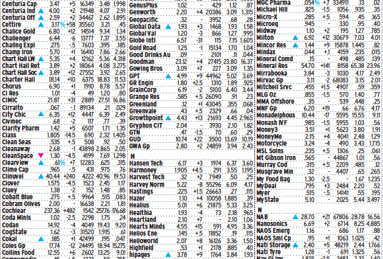
Data is provided to The Sydney Morning Herald by Morningstar.
Look at all the blue triangles. In the SMH last Saturday, I counted 70 stocks at 12-month highs on one day, and only eight red triangles for 12-month lows.
The red triangles are often revealing. The media focusses more on spectacular price increases that double or triple and make a company founder wealthy (including a picture of a wealthy, handsome couple with beaming smiles), rather than the subsequent tumble. The red triangles are a reality check. Remember all the massive gains on Buy Now Pay Later (BNPL) stocks, where the market backed every entrant in the wake of Afterpay's success? Where are they now?
| BNPL company |
12-month high |
Price on 4 September 2021 |
| |
|
|
| Splitit (ASX:SPT) |
$1.72 |
$0.43 |
| Openpay (ASX:OPY) |
$3.80 |
$1.33 |
| Sezzle (ASX:SZL) |
$11.99 |
$6.59 |
| Zip (ASX:Z1P) |
$14.53 |
$6.78 |
| IOUpay (ASX:IOU) |
$0.85 |
$0.30 |
| Humm (ASX:HUM) |
$1.39 |
$0.84 |
There's a reason why the triangles are red, with a lot of damage jumping on that bandwagon.
It’s also instructive to see the market’s focus and trends. On this one day, the table shows:
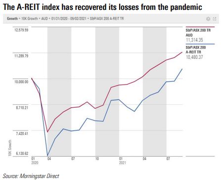
- Highs for a wide range of property funds (A-REITs)and property companies, such as GPT, Growthpoint, Centuria Industrial Fund, Charter Hall Long WALE, Charter Hall Social Infrastructure, APN Industrial Fund, Arena REIT, CVC, SCA Property, Sunland and Lifestyle Communities. The companies Goodman and Charter Hall which have benefitted most from the success of industrial property during the pandemic are also near all-time highs. The market has chosen the property winners, including many that were heavily marked down in 2020 but they have come roaring back despite extended lockdowns. Expectations that commercial real estate could not collect rent from tenants through the pandemic were too pessimistic.
- Listed funds such as Cadence, Milton, Spheria, National Storage and Clime (one cent off a high), fund manager Pendal and banks NAB and Macquarie show financials recovering after taking a pounding in 2020. For example, Cadence has a 12-month low of $0.695 and is now $1.265, Spheria’s low was $1.475 and high $2.52, Milton $4.01 to $7.03. Many have increased their NTA plus removed some of the discount to NTA.
- Specific stocks on a roll, such as Ramsay Health, WHSoulPatts, South32, Whitehaven, Iluka, PWR, Tech One and Paladin. We have featured some of these stocks recently, such as here and here.
Here is a graphical representation of the A-REIT recovery as reflected in the yearly highs, plotted with the S&P/ASX200 Total Return index since 01/2020.
As an aside, anyone who picked up The Weekend Australian for this exercise might have broken into a sweat. Almost every stock was marked at a 12-month low. Somebody pressed the wrong button.
Lessons when there are many more winners than losers
With so many companies reaching their highs, how should investors react?
- Revisit your long-term strategic asset allocation and rebalance where necessary. It is likely that investors with stocks doing exceptionally well are not only overweight a particular company but also in their equity asset allocation. It might be time to take something off the top in both.
- Stay invested. Markets often thrive on momentum and there are few signs interest rates will rise, leaving the TINA trade intact. In particular, individual stocks may have bright prospects and not be overvalued even if the market as a whole is expensive. Some of the Australian property stocks and funds fell heavily in 2020 and their valuations may be reasonable.
- Don’t assume the market will stay at this level. It’s easy to take risk when markets are rising but at some point, there will be a correction. It is difficult for any investor to avoid FOMO.
- Avoid behavioural cliches such as 'let your winners run' or 'nobody ever went broke making a profit' or 'the trend is your friend'. For every Afterpay that kept on running, there is a Kogan which peaked at $25.57 and is now around $11. These popular phrases have a place but each individual stock should be considered on its fundamentals.
It's a trade-off, even between these four points. If a portfolio becomes more concentrated, a mistake is more expensive, but if winners are sold, future success can be reduced.
Whether guided by dots, dashes or triangles, don't go round in circles but stick to your long-term plan.
Graham Hand is Managing Editor of Firstlinks. This article is general information and does not consider the circumstances of any investor.