Much has been written about the ‘exceptional’ performance of the US stock market versus the Australian index. However, the reality is not in line with the perception.
Similar to the All Ordinaries Accumulation Index (AOAI), the Dow Jones Industrial Average (DJIA) comprises a vast array of sectors and subsectors. In recent times, the US Technology sector – as represented by the NASDAQ Composite (NASDAQ) – has outshone and outperformed all other indices by a substantial amount. The ‘Magnificent 7’ have certainly experienced a period of ‘exceptionalism’. This has led to the NASDAQ notably outperforming even its equivalent ASX Technology Index (XIJ), especially since Q3 of this year when the indices diverged considerably. The chart below shows this, with the green line representing the Nasdaq, the white line the ASX Technology Index, while the blue and red lines are moving averages around XIJ.
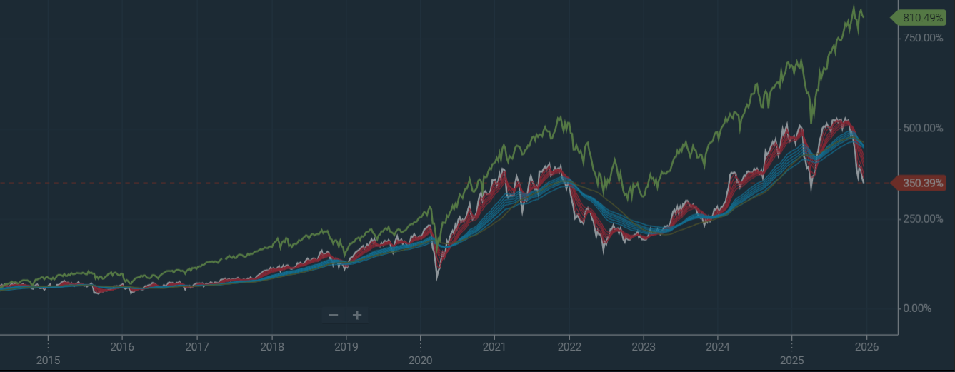
Source: IRESS
However, NASDAQ is not the US market. The NASDAQ does not represent the US economy or the experience of investors in that economy. It is a subset in the same way that the XIJ is a subset of the Australian market. To compare the NASDAQ to the AOAI, would be akin to comparing the DJIA to the Australian Resources Sector during one of its many boom cycles.
Rather, if we compare markets as a whole, the picture is rather different.
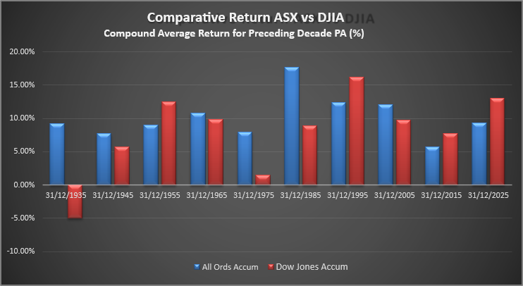
Source: Katana Asset Management Analysis
In the prior chart, the red bars represent the average per annum return for the Dow Jones Industrial average (including dividends) broken up by decades. The blue bars represent the same data for the Australian market.
The first lesson to draw from this graph, is that over the very long term, Australian equities have actually outperformed the US market, and with substantially less volatility.
In terms of performance, the compound average annual return for the Australian market has been 10.15% over the past 100 years. For the DJIA, the comparable figure is 7.85%. This is quite different to the common perception.
And these returns have been achieved with lower average volatility. For example, the average per annum return for the AOAI over a decade has never been negative, whereas during the depression years, the US market averaged -4.97% per annum (even with the benefit of dividends). Similarly, in the decade ending 1975, the US market returned an average of 1.48% per annum, whereas the Australian index averaged 7.91% per annum.
As a final point on this first lesson, it is also pertinent to remember that this data does not include franking credits. Our analysis suggests that since franking credits were introduced in 1987, this has averaged approximately 1.3% per annum.
The second lesson to be drawn from this data is that market strength runs in cycles. In the three decades ending 1965, 1975 and 1985, the ASX outperformed the US market. In the decades ending 1975 and 1985, this out-performance was immense. Of course, more recently in the decades ending 2015 and 2025, the US market has been the stronger performer. And this can lead to a skewed view of the world. But cycles of performance are not measured in weeks or months, but rather years and decades.
This really bores out the third lesson: the ASX has had a period of quite significant under-performance in the past 2 decades. Especially in the decade ending 2015. In fact, if we strip out dividends, capital growth for this decade was a miserly 1.18% per annum. This is a long way short of the 6%+ pa capital growth we would normally expect to experience. Again, this can lead to a distorted perception that the glory days for the ASX are over. However, investors who take the time to understand history will realise that this is part of a much larger but repetitive cycle.
This leads to the fourth and final lesson: history supports the view that the ASX will have a period of comparatively stronger performance in the coming years. Even though we may struggle to see the drivers as we sit here today, history tells us that they will emerge. Most recently, the National Bank of Canada tipped Australian equities as having amongst the best prospects on a 10- and 30-year perspective. And it’s not a fringe view. It’s shared by a group of global asset allocators collectively managing more than $27 trillion, including Vanguard, State Street, and MFS.
Looking forward, it may be hard to see what might drive the next wave of ASX out-performance, but history is a good guide and should not be dismissed. At Katana, we have identified some areas that make us cautiously optimistic:
- Destination of Desire (Immigration) - the quality of living in Australia is highly attractive from a global perspective. In 2024, Australia ranked number #5 globally for the net-inflow of millionaires. Skilled and affluent migrants have an enormous and direct impact on the flow of capital, consumption and taxes.
- Resources Boom - Australia remains the second-largest producer of natural resources globally. LNG, lithium and critical minerals are growing in importance, supplementing long term stalwarts in iron ore, coal and gold.
- Tourism - some European countries (such as Spain) are tapped out and looking at limiting tourist visas. Australia is particularly well placed to grow tourism, especially in light of our proximity to the massive emerging middle classes in China and India.
- Superannuation System and Financial - Australia’s superannuation pool remains the 4th largest globally, which when combined with strong corporate governance, provides the critical mass for a strong yet stable regional financial hub.
- Agriculture - the global middle-class is growing substantially, requiring higher rates of protein per capita. Australia has abundant and clean land, in good proximity to these emerging demand centres.
And of course there are many other reasons to be optimistic, including the international student industry, our recognised global expertise in health and a growing entrepreneurial DNA which has spawned a modest but not insignificant number of leading technology companies. But whether or not it is these factors that ultimately drive comparative outperformance, what many decades of data indicate, is that it will come.
Summary
- Australian Equities have outperformed the US over the long term (plus franking credits), and with substantially less volatility
- Market returns run in cycles
- Australia has had a period of underperformance in the past 2 decades
- There are reasons to be optimistic that this will revert at some point in the future.
Romano Sala Tenna is Portfolio Manager at Katana Asset Management. This article is general information and does not consider the circumstances of any individual. Any person considering acting on information in this article should take financial advice. Past performance is not a guarantee of future performance. Stock market returns are volatile, especially over the short term.
Notes on statistical calculations
- Compound annualised return is the most representative measure. It is calculated by compounding each annual return for the decade to arrive at a true compound result. Then the amount is ‘reverse compounded’ to arrive at an annualised figure using the formula (1+compound total)^(1/10)-1.
- The annualised return in (1) is lower than a linear statistical average annual return for the decade but represents the true figure allowing for the vagaries of statistics. For example, a 50% increase followed by a 50% decline arrives at a linear average of 0%. However, in compound terms, a 50% rise followed by a 50% fall is a net fall of 25% from the original index starting point. Reverse compounded, this arrives at a return of -13.4% pa (((1-25%)^(1/2))-1).
- The All Ordinaries Accumulation index commenced in 1979, from which time accurate dividend data is available. Prior to this, only estimates were available. The average dividend yield during this 46-year period was 4.51%. This has been assumed for the earlier years when data was not available.
- Similarly, the average dividend yield since records commenced in the DJIA is 2.71%. This has been applied to earlier years to calculate an approximation for the DJIA accumulation index.
- The S&P 500 is a more complete representation of the US market. However, despite recent variations in performance, over the past 100 years, the 2 indices have performed largely in line.