Register For Our Mailing List

Register to receive our free weekly newsletter including editorials.

Home / 178

Is the housing market in bubble territory?

Housing is expensive in Australia. Measured as a multiple of average wages, Sydney residential property costs nearly 1½ times that of London and over twice that of New York. All eight of Australia’s capital cities are dearer than Boston, Washington, Chicago, and Tokyo.

But let’s put housing in a wealth perspective. The diagram below shows the assets and liabilities of Australia’s households using the latest official ABS data (2015). Housing represented 53% of all assets, but a lower 45% if net of mortgage debt. Even adding in household durables (furniture, appliances, cars etcetera) doesn’t bring the total to half of net assets, so the majority of our net assets now resides in financial and commercial products.
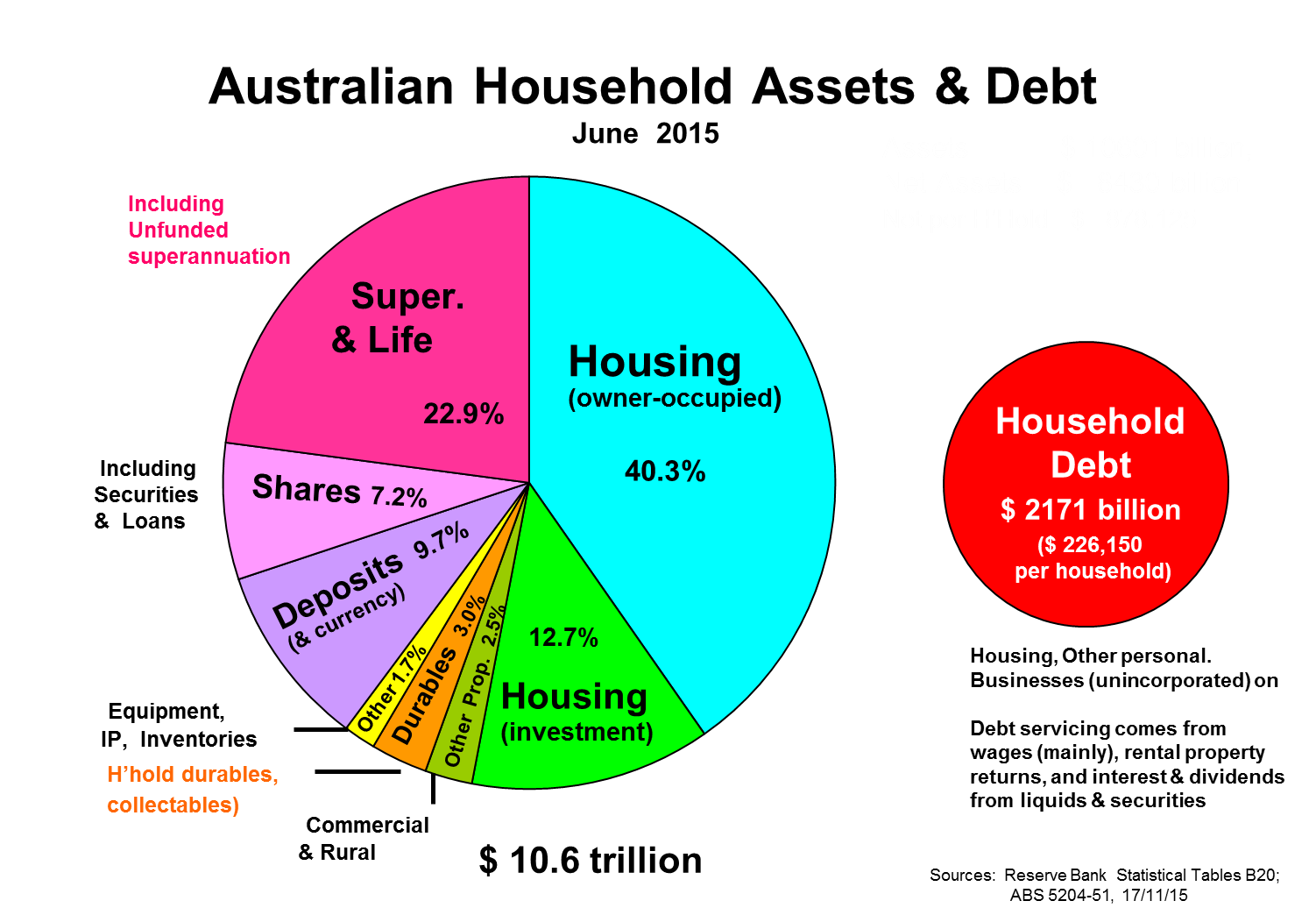
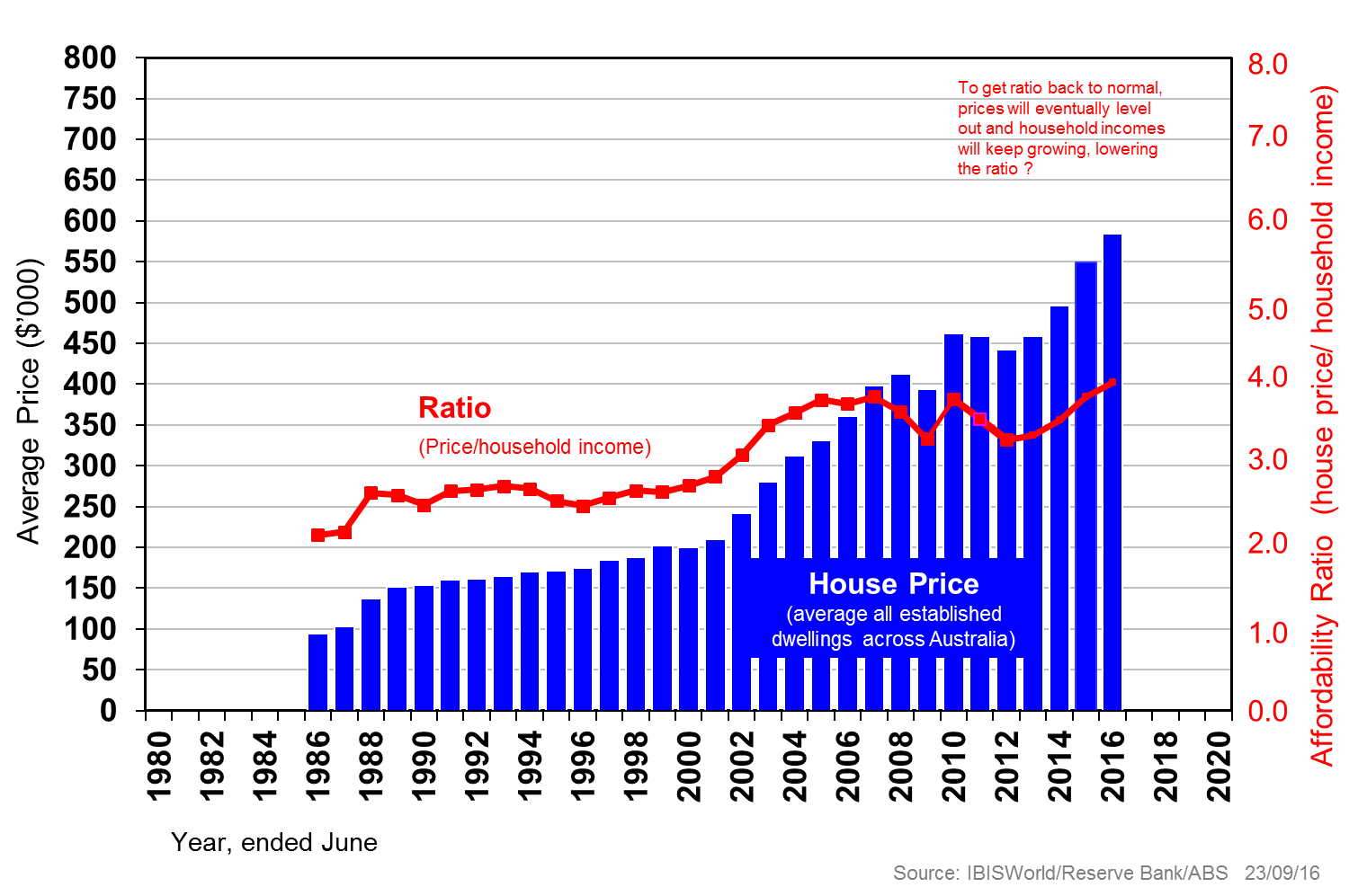
We have over 10 million dwellings which had a total value of $5.9 trillion in 2016, or 3½ times Australia’s annual GDP. There were almost three times as many houses as flats and apartments, the average dwelling costs just over four times average household income, and was valued at $584,000 in June this year.

Our density is just over 2.5 persons per dwelling, half that in 1901. Our dwellings are now much bigger, nearly three times, with three or more bedroom dwellings accounting for almost three-quarters of all residential properties. The table below adds some more perspective.

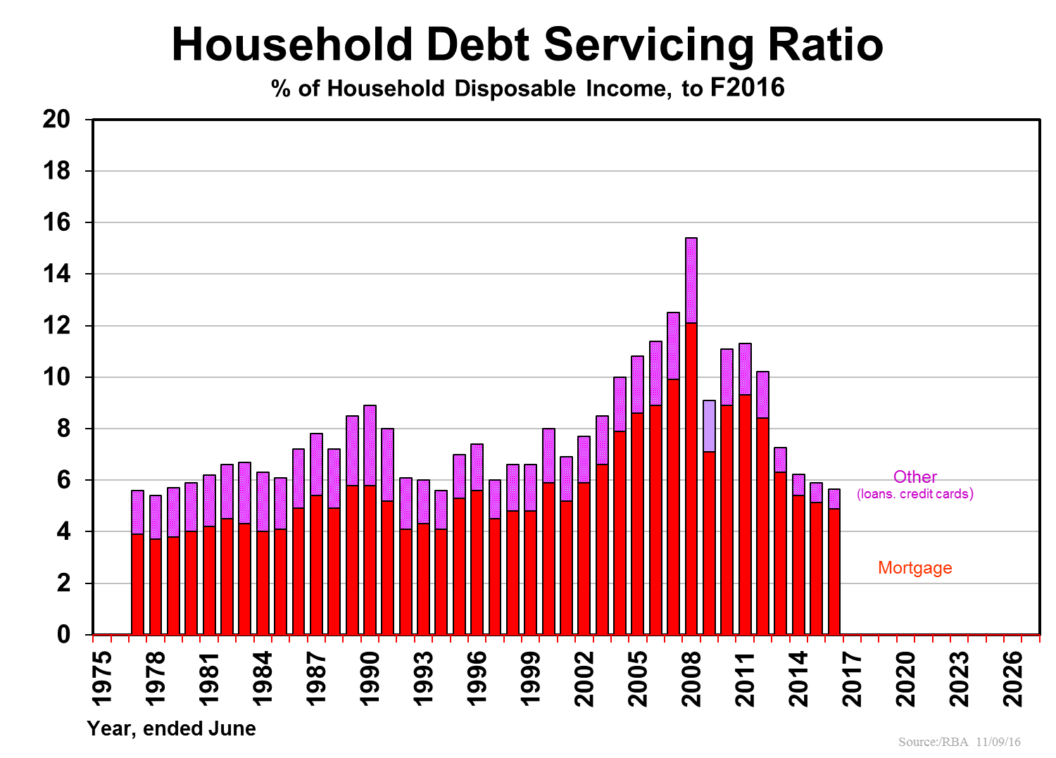
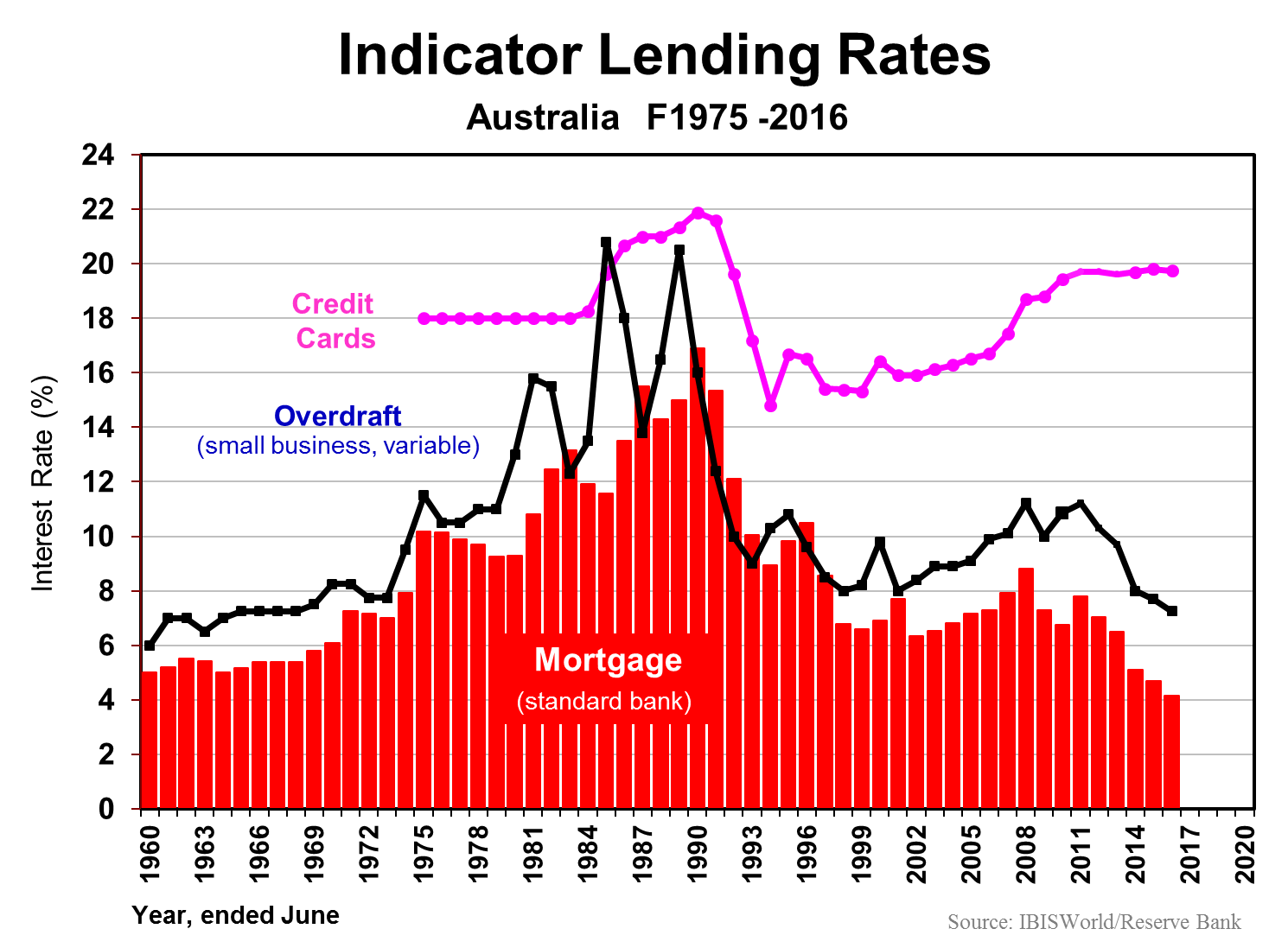
Australians borrowed $400 billion last fiscal year for new housing plus alterations and additions to existing dwellings. We can afford all this on top of existing debt, as the two following charts suggest. Debt servicing is as low as it’s been in five decades, due to record low interest rates.
Our capital cities

Australia’s population is one of the most urbanised on the planet, leaving aside city-states such as Singapore and Hong Kong, but prices across our capital cities vary enormously.
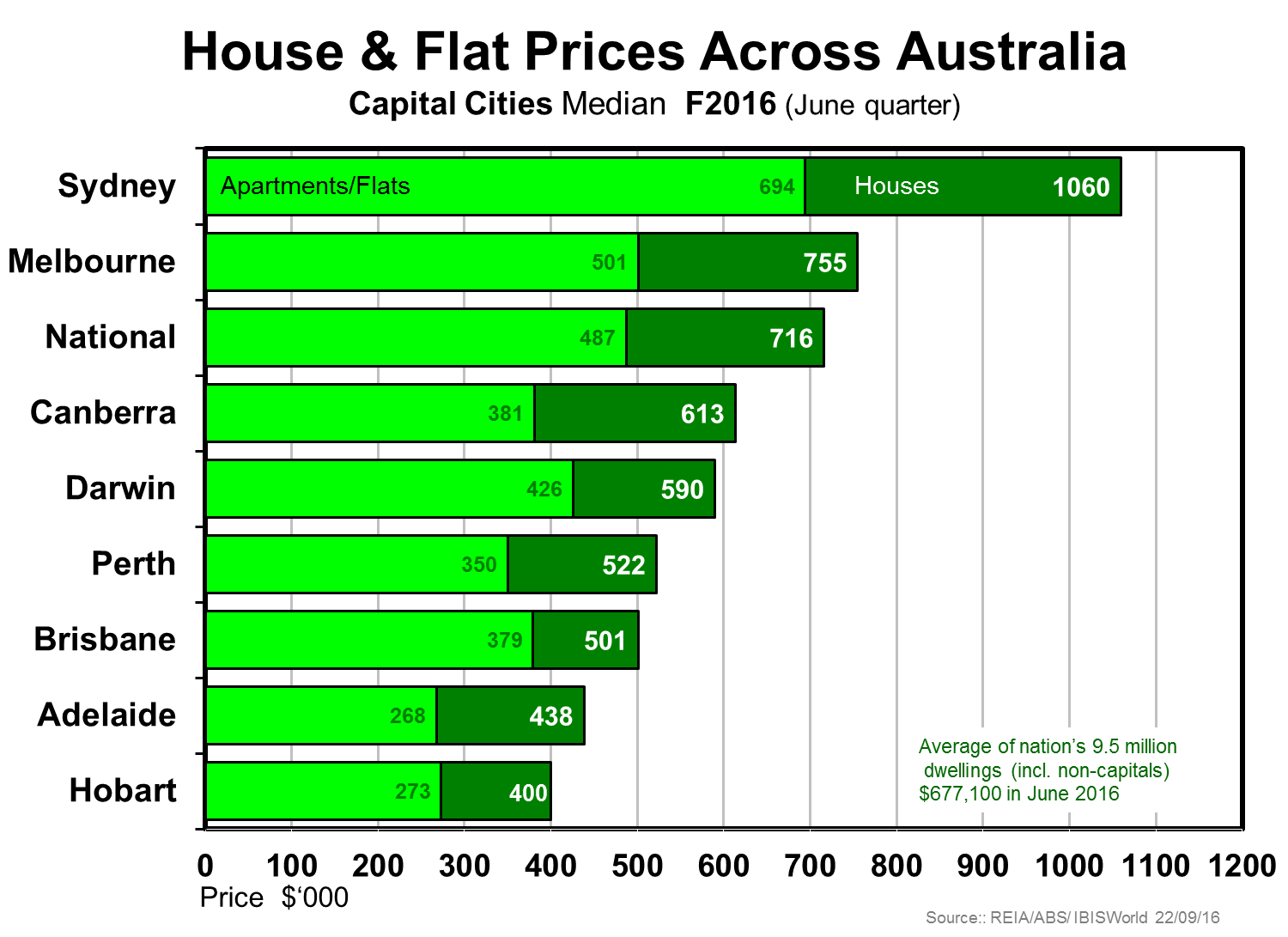
Sydney is the odd-one-out given its prices are so far ahead of the second priciest market Melbourne. The two charts below suggest the degree to which Sydney prices seem to be well over trend compared with Melbourne.
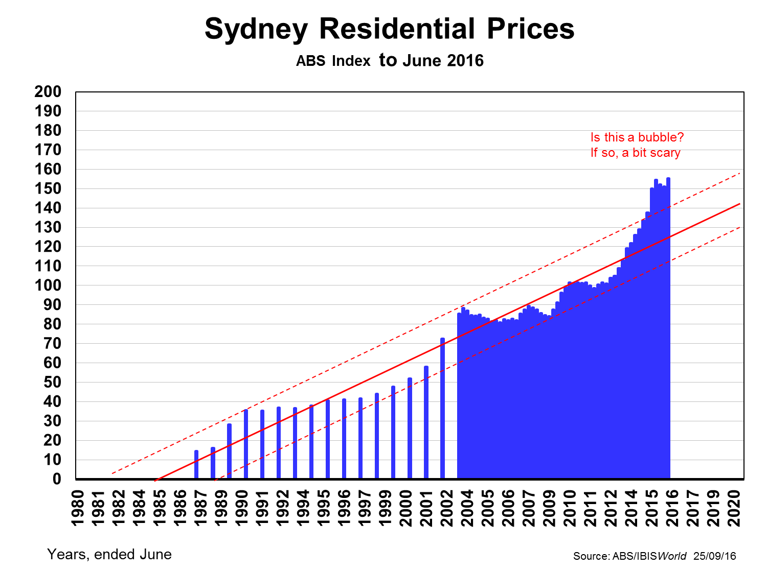
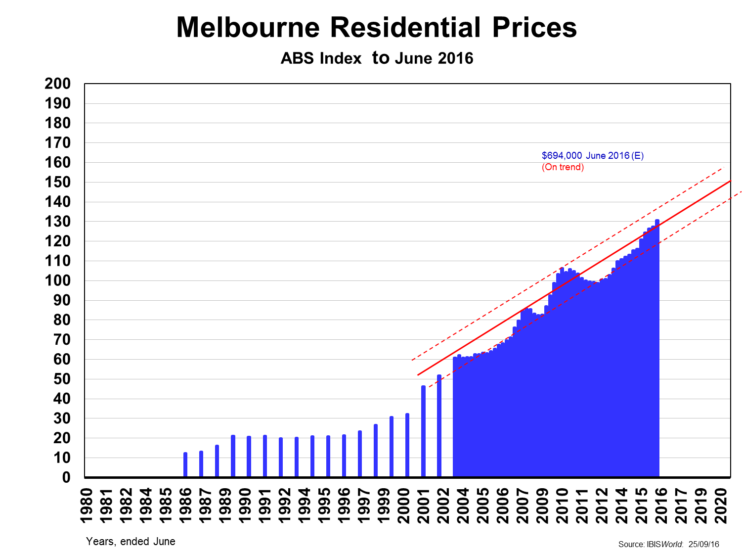
The difference is even more marked when we compare just apartments. Sydney had been under-supplied for nearly a decade, whereas Melbourne had gone into overdrive, leaving Sydney over the past year a sellers-market (prices over-trend by 12-13%) and Melbourne the opposite: a buyers-market, with prices 7-8% under-trend.

The indications are that price growth is abating as we head into 2017. In FY16 prices have fallen a little in Canberra and more in the mining states with their capitals - Darwin and Perth. – falling by 5% or more over the 12-month period.

So what?

Firstly, Australia’s economy is not threatened by its world-leading dwelling prices: they are affordable as seen by the earlier debt servicing graph where the ratio is the lowest in some five decades. The chart below reinforces the fact that we have lived with an affordability ratio in the high range (3½-4 times household incomes) for a decade and a half, without dire things happening.
Yes, Australia’s household debt (mainly mortgage debt) as a share of GDP is one of the highest in the world, but manageable. And our corporate and government debt as a share of GDP are among the lowest, if not actually the lowest. Overall, we are not living too far above our means compared with most other developed nations.

Sydney is the stand-out loner among our capital cities. Its economy and that of NSW are doing well, indeed the best in the nation, but that may not protect it from a dwelling price correction in the year or so ahead, or a longish period of prices flat-lining until incomes catch up to restore equanimity.


Phil Ruthven is Founder of IBISWorld and is recognised as one of Australia’s foremost business strategists and futurists. This article is general information and does not consider the needs of any individual.


  •   20 October 2016
  • 5
  •      
  •   
5 Comments
David
October 20, 2016

I'm a bit confused about the debt servicing graph. 5% of household disposable income??

I'm assuming this must be an average figure which has been dragged down by people who purchased property some time ago and have been paying off their loans for a long while. At the other end of the scale there are lots of people with significantly higher debt servicing ratios than that. Banks don't foreclose loans based on average serviceability across their lending portfolio. They monitor each loan individually. A more meaningful statistic might be what percentage of total loans are held by people with very high servicing ratios.

I'm also a bit surprised at the "trend" line. It appears to be based on only 30 years worth of data. Longer data series indicate a much lower trend, and suggest that the last 20 years of property prices are way above trend and overdue for a correction. Either that, or long term trends are no longer relevant because "this time is different", "this market is different", "we are undergoing a paradigm shift" or "this is the new normal".

Kevin
October 22, 2016

I think manageable is the key word.I bought an investment property in 1990 for around 100K.annual income of around 30K,interest rates @ around 19%.

Close to 66% of gross income just to pay the interest on the loan.Thankfully the rent and tax rebates saved me from bankruptcy,but it was very difficult.The bank should not have lent me the money,however that was still my fault,not theirs.

Today I still own that property and it can be bought for around 500K,average income in WA around 80K,interest rates @ 4%.To pay the interest on the loan is 25% of income.We are constantly told that houses are overpriced and nobody can afford to buy, and houses were so cheap years ago.The mind boggles.

Say in 30 yrs time will history repeat and everybody will be saying exactly the same things as today .Nobody can afford to buy a house,houses were so cheap in 2016.

Is it a case of the only lesson that history teaches us is that people refuse to learn the lessons that history teaches us.

Should rent not be looked at as an incalculable amount of debt over the coming 30 yrs.i am old now,all of my life people have kept repeating that nobody can affoed to buy a house,from the 1950,s on time has proved it to be nonsense.

Murray Rothbard
October 26, 2016

The residential price charts start around 1986-1987, when interest rates were still on the way up but approaching their peak. A key factor in the performance of residential land over this period has been the fact that interest rates (and mortgage rates as a result) have been in a sustained downward trend.

All long duration assets have benefited greatly from this trend, especially residential land in capital cities such as Sydney and Melbourne.

I find it almost impossible that the same type of performance can be replicated over the next 30 years with interest rates at their current level.

Bruce
October 31, 2016

Despite the hype and optimism of property spruikers hoping for more interest rate cuts to maintain the upward trend, one factor against replicating the same type of housing price growth is the possibility of changes to negative gearing or capital gains tax concessions. Superannuation has already had a haircut and governments looking to raise revenue are likely to change the current policy settings for investment property.

Shimajiro
November 28, 2016

It's a bit concerning that a movement of 2% in interest (2006-2008) lead to an increase of 5% in % of household income, and that current serviceability is almost the same as when interest rates were 16%. Won't it be exciting if interest rates are forced up a bit.


Leave a Comment:

RELATED ARTICLES

The 3 biggest residential property myths

Australian house prices close in on world record

Clime time: What's left unsaid in Australia's housing bubble

banner

Most viewed in recent weeks

Are you making these SMSF mistakes?

After four decades advising investors, there are a few common mistakes I've seen SMSF investors make. From holding too much cash and chasing yield to overtrading and trusting tips. Are these errors costing you?

Why have Australian living standards 'fallen' and how do we fix it?

For the last few years there has been much talk of a 'cost-of-living' crisis in Australia and of 'falling living standards'. Lately this has flared up again with the pickup in inflation resulting in a renewed fall in real wages.

Will you run out of money in retirement?

Fear of running out has become a defining retirement anxiety. Why do some retirees die with substantial wealth while others deplete their nest egg? Evidence suggests the answer is more complicated than we think. 

Retirement spending is not one-size-fits-all

New data challenges the idea that Australians are underspending their super. The bigger issue may be helping retirees navigate complexity, make confident decisions and use their savings to support security, wellbeing and choice.

Four options for an income investor’s next dollar

What if Australia’s golden age of dividends is ending? Rather than overhaul your portfolio, it may be worth considering where new capital can work harder. I discuss four income strategies and the trade-offs behind each.

The missing link in the CGT debate

A little-noticed consequence of Labor’s tax changes could have implications well beyond investors’ tax bills. The issue raises bigger questions about incentives, capital allocation and the drivers of long-term economic growth.

Latest Updates

SMSF strategies

Meg on SMSFs: What do we think about reversionary pensions these days?

Reversionary pensions have long been a staple of SMSF estate planning, but are they still the best option? Meg Heffron revisits a once-clear favourite and asks whether changing super rules have shifted the balance.

The ageing ‘crisis’ has not and will not happen

Rising age dependency is frequently treated as a warning sign for economies. But when actual workforce participation is examined, a strikingly different picture emerges about ageing, productivity and economic sustainability.

Retirement

How does the 4% rule stack up?

The 4% rule has long been retirement's gold standard. But after a difficult period for investors, fresh analysis suggests a more conservative approach may significantly improve the chances of making savings last.

Shares

Four charts that expose market concentration risk

Investors have recently been rewarded for backing market leaders, but history suggests this eventually comes at a cost. Now may be the time to review whether your portfolio is carrying unintended risks beneath the surface.

Investment strategies

The case for gearing beyond property

Most Australians gear into property but ignore shares. That may be a mistake. Used carefully, geared equity strategies can enhance long-term returns, reduce cash tied up in growth assets and support retirement income goals.

Economy

Australia's $1 trillion debt pile

The headlines exclaiming that Australian government debt has hit A$1 trillion and US government debt has hit $40 trillion has turned heads, but how serious are they really? Will Australia's mix of debt create challenges?

Economy

Has 100 years of growth made us any happier?

For decades, GDP has been the benchmark for economic success, but has it made us materially happier? If happiness does not rise in lockstep with prosperity, are we overlooking what constitutes a successful society?

Sponsors

Alliances

  • ASA-Logo-RGB-ActiveGreen-web.png

© 2026 Morningstar, Inc. All rights reserved.

Disclaimer
The data, research and opinions provided here are for information purposes; are not an offer to buy or sell a security; and are not warranted to be correct, complete or accurate. Morningstar, its affiliates, and third-party content providers are not responsible for any investment decisions, damages or losses resulting from, or related to, the data and analyses or their use. To the extent any content is general advice, it has been prepared for clients of Morningstar Australasia Pty Ltd (ABN: 95 090 665 544, AFSL: 240892), without reference to your financial objectives, situation or needs. For more information refer to our Financial Services Guide. You should consider the advice in light of these matters and if applicable, the relevant Product Disclosure Statement before making any decision to invest. Past performance does not necessarily indicate a financial product’s future performance. To obtain advice tailored to your situation, contact a professional financial adviser. Articles are current as at date of publication.
This website contains information and opinions provided by third parties. Inclusion of this information does not necessarily represent Morningstar’s positions, strategies or opinions and should not be considered an endorsement by Morningstar.