The below chart shows the US share market since 1920 divided into ‘boom-bust’ cycles. Here I define a 'bust' as a decline of 20% or more for the market index. A 'boom' is the rally from the bottom of a fall of 20% or more to the start of the next fall of 20% or more, so the bottom of each bust is the starting point for the next boom-bust cycle.
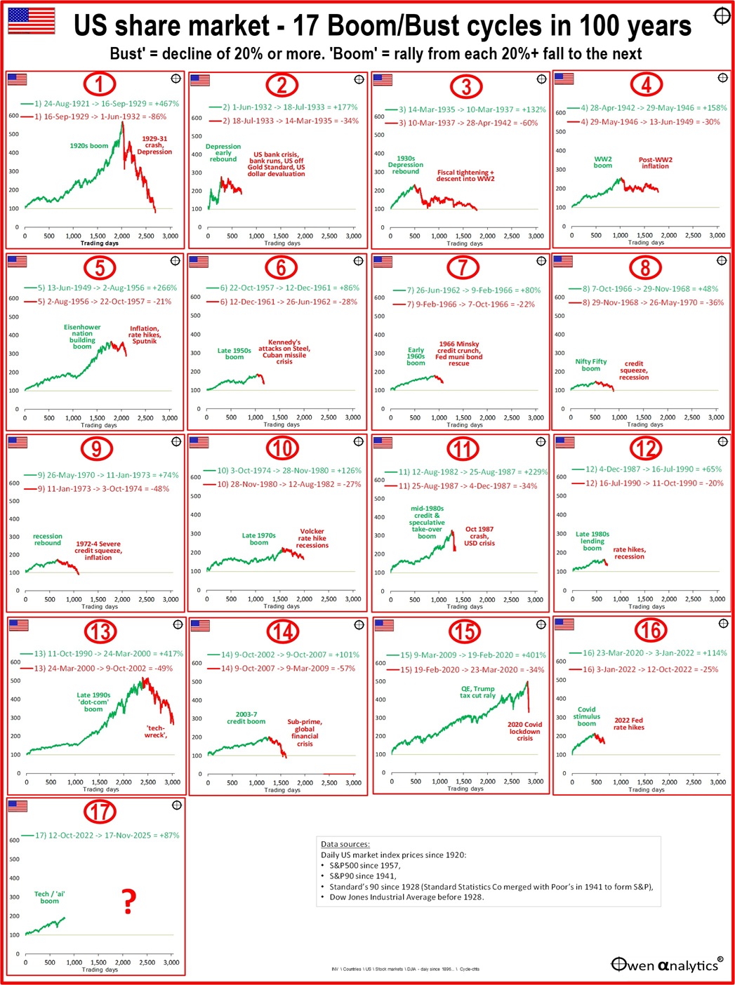
The scales for the y-axes (vertical, for height of boom and bust) and x-axes (horizontal, for length in trading days) are the same in each chart, so we can easily compare the different heights and durations of the booms and busts in each cycle.
For example, we can see that the biggest (highest) boom was cycle 1 (the Roaring 1920s speculative boom). Not far behind that was the 1990s ‘dot-coom’ boom. Both booms ran for nearly a decade into extreme levels of over-pricing, and both suffered deep crashes (and deep national and global economic contractions) that took many years to recover.
Why worry about boom-bust cycles at all?
It is all very well to say that the overall share market has delivered returns averaging 11% per year over the past century or the past half century (which it has). ‘Time-in-the-market’ beats ‘Timing-the-market’ – right?
The problem is that ‘time-in-the-market’ only works over very long periods of time. You and I don’t have investment time frames of a century or half century, so we are not going to get those nice ultra-long-term returns (and those are past returns, not future returns).
You and I have shorter term ‘investment horizons’ - like a few decades, which means our returns vary greatly depending on what stage of the boom-bust cycle we happen to be in.
What causes booms and busts?
Putting aside the academic ‘efficient markets hypothesis’ (which claims that every asset in every market is at all times perfectly fairly priced, and instantly reflects every relevant piece of information, and therefore ‘booms’ and ‘busts’ don’t exist), there are three main real-world answers to this question.
First – Most cycles are driven or accompanied by economic cycles, or more specifically, cycles in investment market conditions driven usually by fiscal and monetary policy cycles, and usually accompanied by investor confidence about growth prospects created by some new idea or technology - eg railways, trade with new colonies, electricity, motorcars, telephones, radio, urban expansion, mineral discoveries, internet, etc. In the current boom it is ‘artificial intelligence’.
Second – Markets are driven by wild human emotions (Keynes called them ‘animal spirits’ in his 1936 ‘General Theory’) like fear and greed (I actually prefer Charlie Munger’s ‘fear and envy’).
Irrational over-confidence leads people to bid up prices of assets to crazy high levels in the euphoric booms, and then irrational over-pessimism leads those same humans to suddenly dump those same assets, which creates devastating busts.
Instead of the usual: ‘History never repeats, but it does rhyme’ (which Mark Twain never actually wrote), I prefer François-Marie Arouet (‘Voltaire’, in Candide, 1759, ch.30) –
‘History never repeats itself. Man always does.’
It’s hard-wired into human nature. We can’t help it. Humans are herd animals. We follow the herd into wild booms, then we follow the herd in the stampede out.
Third – Often there is an additional incentive that provides a kicker or accelerant to booms – some new element that opens up new markets or allows more investors access to markets. This could be in the form of a new tax break (like franking credits, or tax-deductibility), or a deregulation (like the repeal of Glass-Steagall, or deregulation of brokerage), or a new financial instrument (like pooled investment trusts, or managed funds, or margin lending, or self-managed ‘superannuation’, or low-cost on-line brokerages, or fractional shares), etc. These types of catalysts result in more people throwing more money into the frenzied booms.
How long will the current boom last?
The left chart below shows the number of months in each boom, and the left charts shows the number of months in each bust:
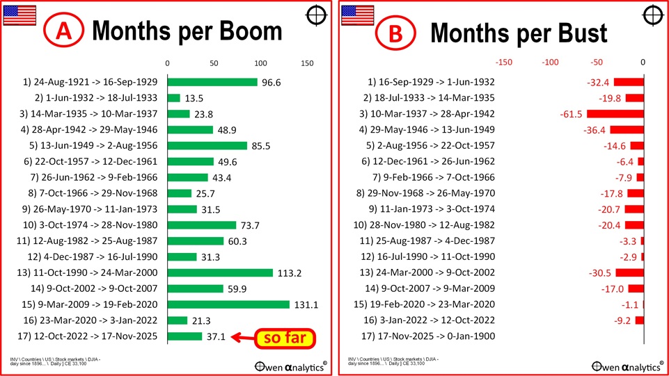
US boom cycles (average of 57 months, left chart) are much longer than the busts (average 19 months, right).
The current boom (cycle 11) started at the bottom of the 25%+ sell-off in 2022 (aggressive Fed rate hikes to tackle inflation). The current boom has now been running for just 37 months so far, which is much shorter than most booms.
Even if we put cycles 16 and 17 together and call them one long US tech/AI boom, it still has been a lot shorter than many prior booms.
How long will the current boom last? Impossible to predict of course, but it is comforting to know that there have been plenty of longer booms in the past. General investor confidence can keep a boom going for many years before the boom finally ends.
Another observation from the above pair of charts is that the busts are a lot shorter than the booms. Overall, the market has been in boom phases for 75% of the total time, and in bust phases for just 25% of the time.
How high can the current boom go?
The next pair of charts show the % gains in the booms (left) and the % declines in the busts (right).
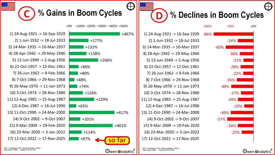
So far (as at mid-November 2025) the market index is up +87% since the start of the current boom, but that is very small compared to the average boom gain of +184%.
Even if we add cycles 16 and 17 together, the market is up some +188% since the start of cycle 16 (ie including the cycle 16 bust in 2022). That sounds big, but that is still no more than the average boom.
It is impossible to predict how high the current boom will go of course, but there have been plenty of booms that went a lot higher. There have been plenty of booms where the market more than doubled, trebled, and even quadrupled before finally collapsing in the bust.
Current is boom quite moderate in strength
One clue to the extent of boom-time frenzy is to look at the slope of the upward price movements in the booms, especially in the latter part of the boom, when the frenzy is usually greatest right before the bust.
We can see from the main chart that the current boom (thus far anyway) has been relatively moderate in terms of the slope of the price index. Remember that the scales for the y-axis (% change) and x-axis (trading days) are the same for each chart, to enable quick ‘eye-ball’ comparisons of the booms and busts.
We can see much steeper upward slopes – especially in the latter stages - in cycles 1 (1920s), cycle 5 (mid-50s), cycle 11 (mid-1980s), and cycle 13 (late 1990s ‘dot-com’).
This is not a predictor of an imminent crash of course, but does tell us that the current level of ‘frenzy’ is still rather mild compared to several prior booms.
The busts take away most of the gains in the booms
We can see from the individual cycles in the main chart that in most cycles the bust took away most of the gains made in the preceding boom. Worse of all, in several cycles the bust took the market back down to a point lower than it was at the start of the boom (cycles 1, 3, 8, 9, and 14).
That is a lot of cycles where even if you got in at the very start of the boom and remained in for the whole boom and then the bust, you would still be below where you started, even a decade or more later!
The final pair of charts show the percentage of the boom gains that were lost in the bust (left chart below), and the next gain from the full boom-bust cycle (right).
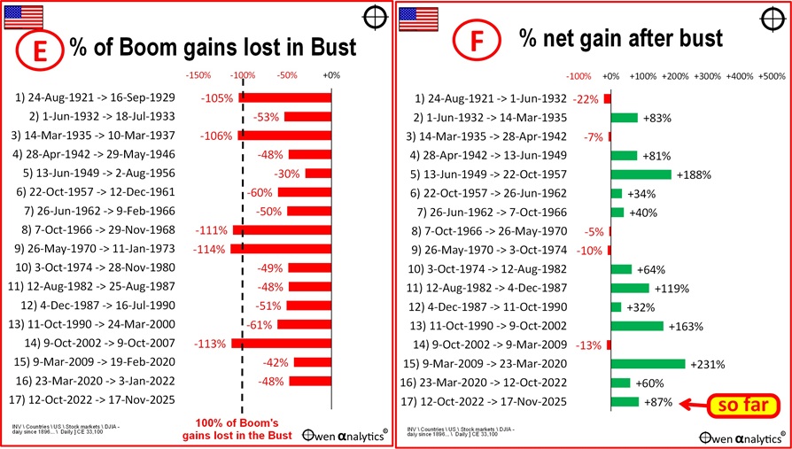
On average across all cycles, the busts took away 68% of the gains made in the preceding booms. In two thirds of cases, the bust took away more than half of the gains made in the preceding boom.
Why is this important? Because many investors fall into the trap of chasing the latter stages of the booms (jumping in for the first time, or doubling down, or worst of all - gearing up). If you get in after the boom is already well on its way, you may enjoy the rest of the boom while it lasts, but you will probably lose all of the gains in the bust that always follows.
This problem is particularly prevalent for first-time investors who nervously wait on the sidelines working up their courage as the boom gathers pace, then inevitably take the plunge in the boom-time euphoria at or near the top of the boom.
Chart F shows the NET gain AFTER what was taken back in the bust – ie the net boom-bust gain. The average net gain from all full cycles was +65.
But in the current cycle we have already gained more than that, at 87%.
What about pricing and valuations?
As in all booms, prices started out cheap at the start of the current boom (which was at the bottom of the previous crash where everything was over-sold and dirt-cheap). Also, as in all booms, prices have been rising more quickly than underlying profits and dividends, as over-confidence builds, so pricing is getting increasingly expensive. Same as in all booms.
Why do booms end?
The problem is that share markets don’t crash when or because they become expensive, or when they reach a certain level of over-pricing. Booms can keep on rising into increasingly over-priced levels for many years before some event or events trigger the eventual bust.
Another problem with pricing measures is that they are often very misleading. For example, at the top of the market near the end of the highest boom of all (cycle 10, the mid 1980s boom), the ASX market pricing was actually very cheap, and provided no warning of the crash that turned out to be sharpest crash of all (October 1987). See - ‘Price/Earnings’ ratios are meaningless – Exhibit A: the 1987 crash (27-Oct-2025).
We don’t know, of course, what will trigger the end of the current boom, but markets can keep running up into extremely over-priced levels before the final trigger for the crash.
The longer and higher the boom, the deeper the crash, and longer the recovery time
For the US, good examples were the 1920s and 1990s booms, which ran up for a decade before crashing into deep busts that took many years to recover. Those busts were also accompanied by long and deep economic contractions.
Government/central bank ‘put’?
There is a good chance that the current boom may run on for a lot longer yet, simply because governments and central banks don’t want it to end!
The ‘Greenspan put’ idea started in the 2000-02 tech wreck, gained prominence in the 2008-09 GFC, and was confirmed in the 2020 Covid lockdown recession crisis. The idea is that in this increasingly populist world, governments and their central bankers will bail out any crisis.
In the GFC and Covid crises, governments bailed out not only banks but inefficient commercial business that ordinarily would have been allowed to fail. They also cut interest rates to zero (negative in some countries) and threw free money at literally everyone and everything. Today there is widespread, and probably justified, confidence that governments and their central banks will do the same again.
As my good friend and former RBA governor Ian Macfarlane says – “Investors believe that the downside risks are small but the upside is unlimited.”
But the boom will eventually end
Even with government/central bank efforts to support economies and markets, the current boom will end in pain for investors here and around the world.
There is a good chance it will be like the end of the 1990s ‘dot-com' boom, where the triggers for the bust included tightening monetary policy, plus a final realisation that the enormous amounts being spent on infrastructure (in that case it was fibre-optic networks) would not generate the promised returns. Boom-time over-confidence can quickly switch to pessimism and then over-pessimism when everybody starts racing for the exits.
There are often some other related or unrelated events that accelerate this sudden loss of confidence – for example, a military flare-up, or a sudden bankruptcy, or anti-trust attack, etc.
Asset Allocation
Because it is the US market’s turn to have the bigger boom and bigger bust, when the bust does arrive, the local ASX market will also fall (as it always does in a general sell-off), but there is a good chance it will fall by less than the US, as was the case in the 1920s US boom/bust and the 1990s/tech wreck, which are the most comparable US-led booms.
Therefore, within share allocations in portfolios (the ‘growth side of portfolios), I am notionally ‘over-weight’ Australian shares relative to most peer institutions (eg industry super funds) and diversified funds/ETFs. I am also less than 50% hedged on the currency risk for international share allocations because the AUD always falls in broad global sell-offs, and so the unhedged FX risk partially cushions the falls from international shares.
(This is pretty standard asset allocation stuff, but I include it here to illustrate that the research I do directly plugs into my asset allocation decisions and recommendations for my own and advised portfolios.)
Meanwhile, enjoy the boom while it lasts - albeit venturing into increasingly over-priced territory.
Ashley Owen, CFA is Founder and Principal of OwenAnalytics. Ashley is a well-known Australian market commentator with over 40 years’ experience. This article is for general information purposes only and does not consider the circumstances of any individual. You can subscribe to OwenAnalytics Newsletter here.
A note on index data
For this article I used daily closing prices for the US market since 1920. I could use the Dow Jones Industrial Average (DJIA) as it is the longest daily US price index. However the Dow was and still is a very narrow index. It included just 12 stocks initially, and still has only 30 stocks today. Another problem is that the Dow is price-weighted, whereas the broader indexes (and almost all other stock indexes in the world) are market value-weighted. For most purposes when talking about the ‘US share market’ I prefer broader, market value weighted indexes where available. Incidentally, using the DJIA for the whole period results in very similar boom-bust cycles, with only minor differences.