Seven key global charts worth keeping an eye on this year are:
- the trend in new coronavirus cases and deaths
- global business conditions and PMIs
- unemployment
- global inflation
- bond yields
- the gap between earnings yields and bond yields, and
- the US dollar.
Overview
Our high-level investment view is that while shares are vulnerable to a short-term correction having run up hard since early November, overall investment returns will be solid this year on the back of economic recovery (driven by stimulus and the deployment of vaccines allowing a more sustained reopening) at the same time that interest rates remain low.
We are likely to see a further shift in relative returns to investments that benefit from recovery - resources, industrials, tourism stocks and financials. This note looks at seven charts we see as critical to the outlook.
Chart 1 – new coronavirus cases
The deployment of vaccines holds hope for a sustained global reopening and return to something more normal and our base case is that this will be successful over the next year or so. Key to watch will be the trend in new coronavirus cases and deaths.
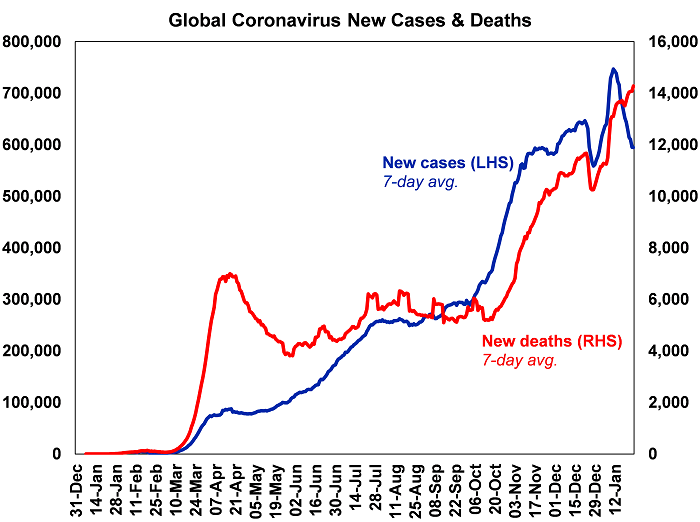
Source: ourworldindata.org, AMP Capital
Global new cases have slowed again lately but this appears to owe more to the latest round of lockdowns as only around 5% of developed countries’ populations and less in emerging countries have been vaccinated. Uncertainty remains around vaccine effectiveness in preventing infection and serious illness, their effectiveness against new mutations, how long protection lasts for, what portion of the population will need exposure or vaccination for herd immunity, etc. That said, there are some positive signs regarding vaccine efficacy beyond formal trials out of Israel where vaccination is above 30%.
Chart 2 – global business conditions PMIs
Global Purchasing Managers Indexes (PMIs) – surveys of purchasing managers at businesses in most major countries – are an excellent and timely guide to the state of the global economy. Since the initial lockdown lows early last year they have rebounded sharply, albeit with the services sector still lagging given distancing restrictions and remain consistent with strong growth this year. They will ideally need to improve further to see our expectation for global growth of over 5% this year and to underpin a strong rebound in profits.
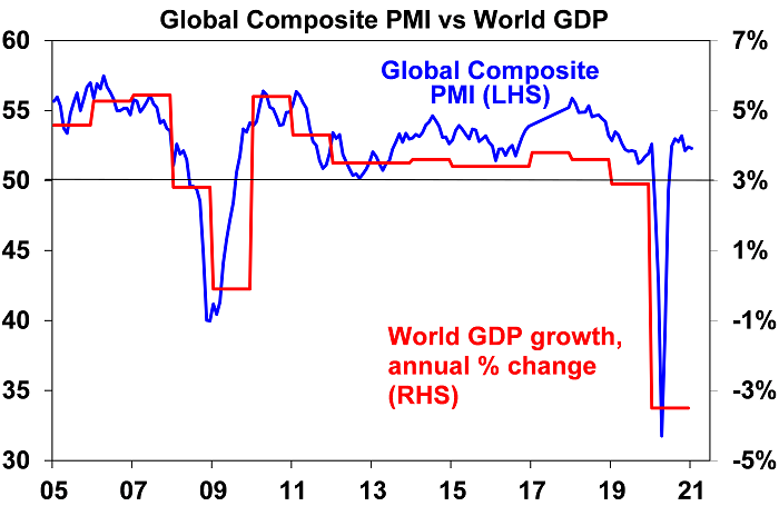
Source: Bloomberg, AMP Capital
Chart 3 – unemployment and underemployment
At present, investors face the ideal backdrop of improving growth but low interest rates. Key to watch in terms of the latter is spare capacity. One of the best measures of this is unemployment and underemployment.
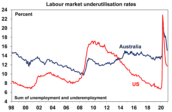
Source: Bloomberg, AMP Capital
The combination of unemployment and underemployment has fallen sharply from last year’s highs but remains relatively high in the US and Australia. A continuing sharp fall from here would bring forward the time when central banks move from easing to being primed for tightening. That said we have a long way to go to full employment as even pre-coronavirus levels did not generate much inflationary pressure.
Chart 4 – global inflation
This year has started with a bit of an inflation scare and US and Australian headline CPI inflation measures look like rising to around 3.5-4% over the year to the June quarter as last year’s June quarter price slump drops out of annual calculations and higher commodity prices feed through. Core and underlying inflation measures will remain the main focus of central banks and right now they are well below target in the US, Europe, Japan and China as is the RBA’s preferred measure of underlying inflation in Australia at 1.2% year on year.
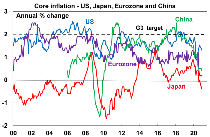
Source: Bloomberg, AMP Capital
Chart 5 – bond yields
Long-term bond yields plunged in the initial stages of the pandemic on safe haven demand and then as central banks bought bonds to inject cash into their economies. Higher long bond yields and steeper yield curves (i.e. the gap between long-term yields and short-term interest rates) are part and parcel of economic recovery as a result of less saving and more borrowing. If we don’t see higher bond yields it would raise concerns that risk taking and investment – or borrowing short and lending long – may not occur. That said, we don’t want bond yields to rise too far too fast lest they boost borrowing costs too quickly and so crimp the recovery and put pressure on share market valuations – as occurred in 1994. So far so good with bond yields up from last year’s lows (by around 0.5% in the US and Australia and less elsewhere) but not dramatically so. More upside in yields is likely this year but too rapid a rise – perhaps as investors who are loaded up on bonds seek to offload them - would be a concern.
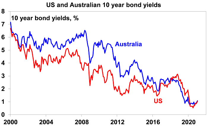
Source: NBER, Bloomberg, AMP Capital
Chart 6 – the gap between earnings and bond yields
The rebound in shares since March has pushed traditional valuations like price to earnings multiples to extremes leading some to fret about overvaluation and a bubble. But shares should trade on higher PEs and hence lower earnings yields when interest rates and bond yields fall. Once this is allowed for, share valuations are not extreme. One way to look at this is to compare the earnings yield on shares (i.e. the inverse of the PE) to the 10-year bond yield. Despite the rally in shares and recent rise in bond yields, it indicates that shares still provide a decent risk premium over bonds. This gap is worth watching – rising bond yields would make shares less attractive, but this can be offset by rising company profits where we expect to see strong gains this year.
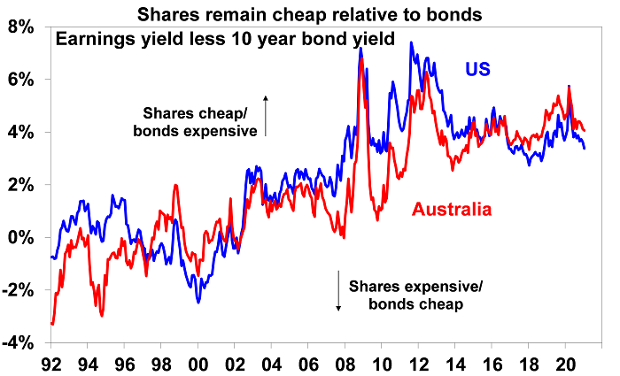
Source: Thomson Reuters, AMP Capital
Chart 7 – the US dollar
The US dollar is a counter-cyclical currency so cyclical moves in it against a range of currencies are of global significance and bear close watching. Because of the relatively low exposure of the US economy to cyclical sectors like manufacturing and materials, the US dollar tends to be a ‘risk-off’ currency, i.e. it goes up when there are worries about global growth and down when the outlook brightens. And a lot of global debt is denominated in US dollars particularly in emerging countries, so when the US dollar goes up it makes it tough for emerging countries. If we are right though, and the global economy continues to recover, then the US dollar is likely to decline further (i.e. the red line in the next chart will fall further) which would be positive for emerging countries. It would also mean more upside for the Australian dollar against the US dollar (i.e. the blue line will continue to trend up) – the big movements in which are primarily a US dollar story.
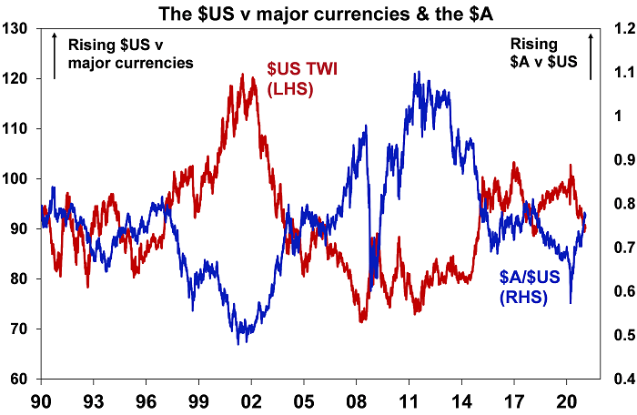
Source: Bloomberg, AMP Capital
Concluding comments
Share markets had a strong rebound in 2020 from their March lows. For further solid gains, beyond inevitable short-term setbacks, the indicators shown in these charts need to remain favourable or move in the right direction. They are worth keeping an eye on.
Dr Shane Oliver is Head of Investment Strategy and Chief Economist at AMP Capital, a sponsor of Firstlinks. This document has been prepared for the purpose of providing general information, without taking account of any particular investor’s objectives, financial situation or needs.
For more articles and papers from AMP Capital, click here.